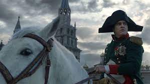
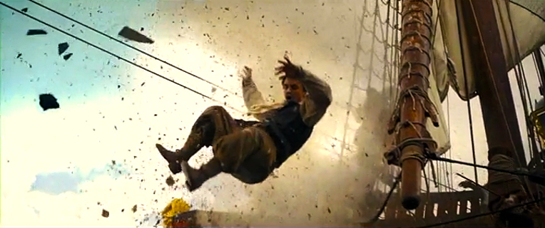
Ridley Scott’s recent spectacular biopic Napoleon is but the latest depiction, following many portraits on the screen of the revolutionary general and self-crowned Emperor. From his beginnings as a humble Corsican soldier to his heroic defeat at Waterloo, Napoleon Bonaparte’s life is a fascinating story that has long appealed to painters as well as filmmakers, and is a good way to examine the hero archetype in art and film.
In his film, Scott borrows heavily from the paintings of the great Antoine-Jean Gros, the painter who accompanied Bonaparte on his campaign and painted the battles in unflinching detail. Gros was a painter who did not only want to capture the heroism of Bonaparte but also the context and the struggle of his life and work.
Gros, Napoleon at the Battle of Eyelau, 1807 The Louvre
(for another analysis of Gros and film see this post)
However, to understand the challenges of depicting real life heroes on screen we need to take a deeper look at how heroes are depicted in art history.
Heroic images of mythical beings and historical paintings were regarded as the pinnacle of artistic achievement. History painting has always shown heroic exploits, battles, and significant events. Despite changing heroes, the heroic form and gesture remain recognisable in visual culture. The “hero” model dates back to ancient epics like Gilgamesh, the Iliad, and the Norse sagas. According to Joseph Campbell’s The Hero with 1000 Faces, similar stories of heroism exist throughout history and across societies. Throughout history, artists have portrayed heroes and heroic acts.
Paintings depict heroic figures rather than realistic ones.
Human culture revolves around heroic characters. They are constantly present, but their appearance may alter. Carl Jung established the concept of archetypes, or “primordial images,” which govern human behaviour from birth. The hero archetype is one of these. Greek mythical characters were the most commonly depicted in paintings, but biblical heroes like David also made frequent appearances. One issue with portraying biblical people as heroes is that Jesus, the most heroic Christian character, does not fit the hero paradigm. Greek mythology was a more reliable source of painting inspiration for ‘heroic’ subjects. Hercules, the legendary hero, has been depicted in art throughout history, from Greek friezes and vases to Renaissance paintings and modern film.
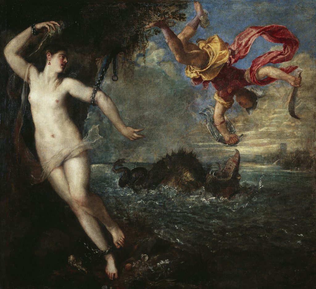
Titian’s painting of Perseus and Andromeda depicts the hero diving into the water to save the woman from a terrifying sea monster. The hero character is distinguished by their mortal or half-mortal status, making their feats even more impressive. The distinction between a Greek deity and a heroic character is that the former is expected to be great and powerful, and basically just fulfils their role as a god. In contrast, the hero must develop heroic qualities. Perseus definitely fits that bill.
TWC61686 Perseus and Andromeda, 1554-56 (oil on canvas) by Titian (Tiziano Vecellio) (c.1488-1576); 175×192 cm; Wallace Collection, London, UK; (add.info.: from Ovid\’s Metamorphoses;); Italian, out of copyright.
The cinema, especially during Hollywood’s golden period, quickly embraced the old-fashioned concept of hero. Heroes always seem to be popular; just look at the success of films like “Alien” with Ripley and “The Matrix” with Neo. In The Matrix, Neo’s sidekick Trinity plays a character reminiscent of the Greek goddesses who aid and eventually fall in love with heroes such as Odysseus and Perseus. The formidable goddess Diana the Huntress, also known as Artemis in Greek, was a common motif in Greco-Roman sculpture, and Trinity incorporates aspects of her.
The indelible image of the hero
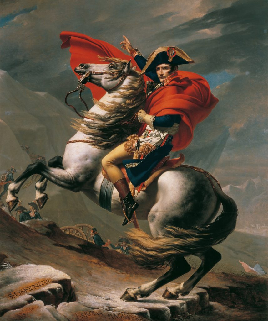
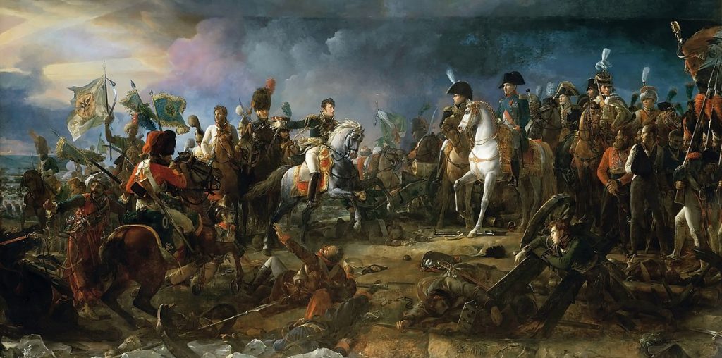
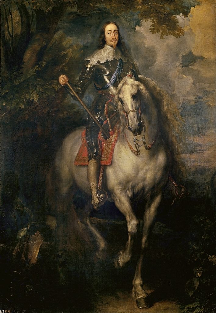
The enduring image of Napoleon Bonaparte is the one by Jacques-Louis David: Napoleon Crossing the Alps.
Napoleon Crossing the Alps ; Artist, Jacques-Louis David ; Year, 1801; Château de Malmaison
Regardless of how radical the French Revolution became Frenchman Jacques-Louis David remained a devoted supporter of the cause. One of the most significant paintings from the French Revolution, David’s The Death of Marat depicts the lifeless body of the murdered revolutionary, a close friend of David, lying in a bathtub. But David changed sides when the radical camp lost and Napoleon came to power. David became Napoleon’s official court painter and painted his coronation after the French leader proclaimed himself emperor and entrenched his power. David was actually offered the position of court painter by the restored King Louis XVIII, despite widespread belief that he would be disgraced following Napoleon’s downfall. The artist stayed loyal to his revolutionary beliefs and declined. It turns out that Napoleon actually rode a mule across the Alps, which is a lot more appropriate animal for a treacherous and tough trek like this. But this doesn’t look heroic, so David has depicted the general riding a magnificent horse that is standing on the brink of a cliff. Looking straight forward, towards victory and triumph, the resolute general keeps his poise. The army advances in the backdrop, with the tricoleur in the lower right and the war machines being carried up the mountainside. Impressive composition: Bonaparte stands tall in the middle of the painting, and a powerful diagonal connects the horse and the mountain, which extends from the upper left to the lower right. The diagonal layout is what draws the eye first and gives off a powerful impression of drama and peril. The forceful alpine winds that the army must contend with are symbolised by the billowing cape, mane, and tail of the horse, which give the impression of wind blowing from behind. But pay attention to the wind: the very winds are driving the general, the horse, and the army onwards to triumph. Even the gods are on Bonaparte’s side, according to David.
Because the horse couldn’t have possibly reared up like that and Napoleon is dressed in a formal ceremonial costume, this heroic painting is blatantly, purposefully exaggerated.
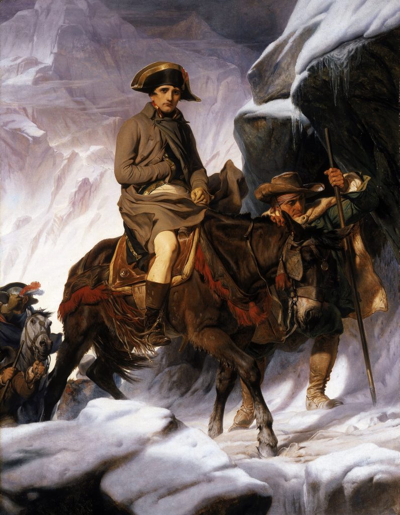
Nearly half a century after Bonaparte’s death, in 1850, artist Paul Delaroche recreated the epic in a more realistic style. Even in the midst of victory, Delaroche’s Napoleon, atop his mule, seems wise and reflective, as if he could already see his eventual downfall.
David’s picture solidified Napoleon’s reputation as a remarkable and heroic leader, and it also proved that heroes might exist outside of mythology. Delaroche’s portrait reminds us that even heroes are human and being a world-winning general is really hard work.
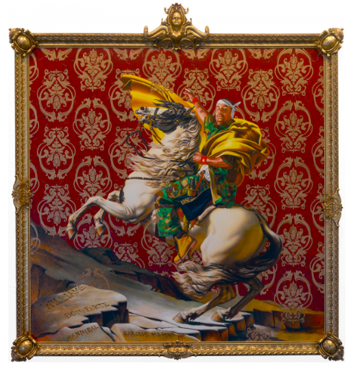
Kehinde Wiley, Napoleon Leading the Army over the Alps 2005 Brooklyn Museum
Contemporary artist Kehinde Wiley produced a painting of a young Black man astride a horse in 2005 titled Napoleon Leading the Army over the Alps. David’s painting is the inspiration. Both David’s and Wiley’s paintings have many of the same basic compositional ideas though the backdrop of the contemporary artwork is ornamental, as opposed to the scenic backdrop of David’s. The hero archetype in art and film can take many forms. Check out some of the other movies that depict Napoleon Bonaparte.
FURTHER VIEWING
Films about Napoleon Bonaparte: how “heroic” is he?
Napoleon (1927), dir. Abel Gance, DP Jules Kruger; one of the greatest history films, owing much to both David and Delaroche Désirée (1954), dir. Henry Koster, DP Milton R. Krasner; a different approach, focusing on the relationship between Bonaparte (Marlon Brando) and Désirée Clary (Jean Simmons) Waterloo (1970), dir. Sergei Bondarchuk, DP Armando Nannuzzi; Rode Steiger’s world-weary General is a tour de force performance, as is the depiction of the charge of the Scots Greys. Adieu Bonaparte dir Yousseff Chaine; Bonaparte is a secondary character in this film about the conquest of Egypt, but he is played very well by Patrice Chereau – well worth seeing. Napoleon (2023) dir. Ridley Scott DP Dariusz Wolski
Sergey Bondarchuk ‘Waterloo’ (1970) with Rod SteigerLa bataille d’Austerlitz. 2 decembre 1805 (François Gérard)
Strongly influenced by visual art, Vampyr is a work of startling beauty and maddening mystery; it is a vampire film like no other
A final version of this essay appears in ThePalgrave Handbook of Vampires, ed. Simon Bacon, Palgrave McMillan 2024.
“Imagine that we are sitting in an ordinary room. Suddenly we are told that there is a corpse behind the door. In an instant the room we are sitting in is completely altered; everything in it has taken on another look; the light, and the atmosphere have changed, though they are physically the same. This is because we have changed, and the objects are as we conceive them. That is the effect I want to get in my film”
Carl Theodor Dreyer
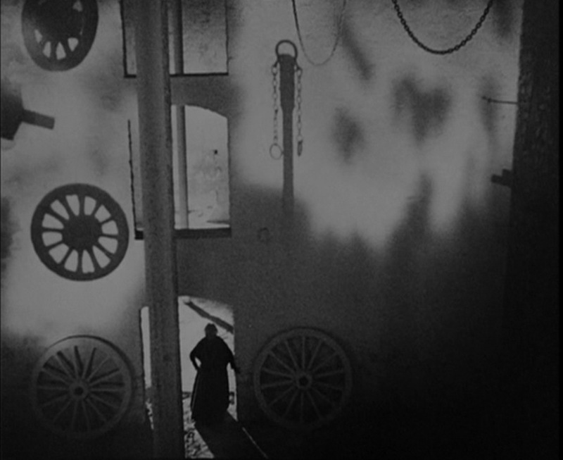
It’s surprising that filmmaker Carl Theodor Dreyer (1889–1968) made a vampire flick, or any horror film for that matter. Before directing Vampyr, the Danish filmmaker had directed the silent 1928 picture La Passion of Jeanne d’Arc, a riveting portrayal of the trial and execution of the French female fighter. The groundbreaking lighting and extreme close-ups achieved by cinematographer Rudolph Maté in that picture, which is based on the transcripts of Jeanne’s trial, are noteworthy. So why did Dreyer, who was known for his spare but powerful dramatic films, decide to make a genre picture with Vampyr in 1932? Keep in mind that Dreyer wasn’t merely cashing in on the vampire film trend; he shot Vampyr on his own in France at the same time that Tod Browning was filming Dracula for Universal Studios. Therefore, Dreyer’s film was distinctly his own, even though he may have been influenced by Browning and others. The film’s star, Vampyr, footed the bill solo, with no backing from studios or industry insiders. Even though he was an acting novice, Baron Nicolas de Gunzburg agreed to finance the film if he appeared in it (as “Julian West”). Dreyer, Rudolph Maté, and the rest of the production team discovered a partially abandoned mansion in the Parisian village of Courtempierre with a meagre budget that could only afford two professional actors. This mansion and its environs served as their setting. The set was a dark, foreboding, and dilapidated building, which the actors and crew said added to the mood that director Dreyer and cinematographer Maté were going for.
The Plot
The Vampyr story is odd but straightforward: at dusk, aimless wanderer and passionate devotee of the occult Allan Grey arrives in a village. Grey leaves his hotel room after hearing guttural mutterings and sees a blind, disfigured man. Soon an angry man bursts into the room and hands him a box . Curious, Grey goes out into the “eerie moonlit night” in search of the man. Moving shadows terrify him. After following shadows, he sees an harsh old woman in a mostly abandoned building. He watches a malformed soldier’s shadow wander while several bodyless couples dance to a fiddler’s lively melody. Grey follows phantom beings to a decrepit manor estate and witnesses the lord shot dead. While helping the grieving Leone and Gisele, the deceased’s daughters, Grey enters a demi-world of terrifying sights. While waiting for the coachman to return with the police, Grey inspects his father’s gift. A vampire book is inside. Gisele sees Leone in the garden, and the creepy old woman hunches over her prone body as Grey and Gisele approach: she is the vampyr! The murdered coachman’s body returns with the coach, and no police. Leone is suddenly overcome by bloodlust and nearly attacks her sister. A strange doctor arrives and arouses suspicion – we see he is actually the vampyr accomplice.
Grey experiences some terrifying lucid dreams that feel real. Rallying, Grey and the servant stab the vampyr in her grave. Leone is released – breathes her last and says, ‘My spirit is free’ but dies instantly. Grey saves Gisele and they leave the village by crossing the river. The doctor rushes to a nearby mill to escape but the servant activates the mill and suffocates the doctor with flour.
A haunted world
‘The people in [Vampyr] glide slowly through a vague, whitish mist like drowned men …. the film is pervaded by nightmare obsession, and it shows a deadsure, calculated use of every means at [Dreyer’s) disposal’
Dreyer’s friend, writer Ebbe Neergard
Languid, slow, sometimes moving like a sleepwalker, the hero Allan Grey (as played by Nicolas de Gunzburg) is a good-looking, well-dressed young man who wanders into the haunted world of Courtempierre. In the first intertitle we are told that ‘This is the story of the strange adventures of young Allan Gray, who immersed himself in the study of devil worship and vampires. Preoccupied with superstition of centuries past, he became a dreamer for whom the line between the real and the supernatural became blurred.’ Grey is a dreamer, already obsessed with the occult. To say Grey is wandering the countryside looking for vampires may be going too far, but his curiosity is amply rewarded when he finds Marguerite Chopin. There are other clues that Grey is not quite ordinary. According to Alex Barrett, de Gunzberg’s ‘sullenly stiff performance only enhances the character’s strangeness.’ (Barrett 2022) Dreyer uses the amateur actor’s limitations to create an affectless protagonist, who undergoes the most harrowing of experiences maintaining a fascinated yet calm demeanor. Indeed the character may be experiencing nothing more than a dream, as the film’s English title Vampyr: The Dream of Allan Gray implies.
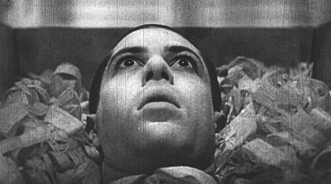
The character drifts into somnolence several times. At the start of the film he goes to bed and is woken by the father. Is what we see next a dream? Certainly Grey keeps falling asleep then is roused into another nightmare. After giving his blood for transfusion to Leone, Grey dreams of a skull, then a skeletal hand clutching a vial of poison. He is awakened by the Old Servant, and rushes into Leone’s room in time to push the doctor out of the way and snatch the vial of poison from the girl’s hand. Chasing the doctor outside he falls, weakened by blood loss; the fall causes him to limp to the garden bench where he falls asleep.
This third slumber offers Dreyer’s most startling and iconic shot: the figure of Grey rises from his sleeping self and embodies a translucent, insubstantial self which moves away. This spectral Grey passes towards us to an empty stone doorway and finds himself is again in the disused building of the earlier scene. A coffin stands, draped on a sheet, nearby is its glass-topped lid. Ripping the sheet away from the coffin, Grey sees the corpse: it is himself. From overhead we see Grey lean down over his dead self. The coffin moves: it is being carried by unseen hands. The vampire peers into the coffin, looking directly at him. The spectral Grey, a sentient corpse, embarks upon ‘the most audacious concept in film history: the corpse’s a view of his journey to the grave’.
Amateur actor Rena Mandel, playing Gisele, also moves like a sleepwalker, though she has an almost permanent expression of huge-eyed fright. She is the story’s fair, innocent, passive ingenue, witness to her sister’s agony and her father’s death. At the end of the tale, she escapes the village with Grey and though it is implied that they are now a couple, there is no hint of a romance throughout the story. As David Rudkin points out, Grey and (especially) Gisele are not fully characterized, nor do they conventionally find each other and fall in love.
The Old Servant, sometimes referred to as Joseph (Albert Bras) has an unexpectedly significant role in the story. It is he whom, taking up the book where Gray left off, understands the nature of the vampire, and is the one who takes decisive action. While Grey is largely passive in the film, the manservant is active: it is he who goes forth to seek the vampire’s grave, where he is joined by Gray. Joseph brings the tools and instigates the destruction of the vampire. However, it is Grey who wields the hammer, the camera ‘framed on the head of the iron shaft stroke by stroke descends with it as it is hammered down into the corpse.’ As he does so, Chopin expires, transforming into a skeleton. It could be argued that, in terms of action, the Old Servant is the actual hero of the story. He delivers the doctor’s final punishment, burying the servitor in a bright white avalanche of flour. As played by Bras, the character is phlegmatic, and carries out his tasks as if they are routine. He is resolute and decisive and does not give in to fear or panic.
Sybille Schmitz, the only experienced film actor in the project, plays Leone. The character needed a subtle actor who could indicate strong feelings and compulsions in a very short sequence. First, we see Leone in bed, very weak and semi-aware of her condition. Schmitz’s ability to convey Leone’s agony elicits the viewer’s sympathy. Saved from the vampire, Leone expresses a wish to die; her suicide is exactly what the vampire wants, and why it gives the vial of poison to the doctor. The moment of pity is then turned to horror when Leone’s expression changes, she is consumed with bloodlust. This is Schmidt’s key scene: Leone feels the urge and, turning her head with a horrible smile, fixates upon her beloved sister Gisele. However, she is too weak to attack. In that brief moment, (in extreme closeup, reminiscent of the shots in La Passion de Jeanne d’Arc) we see the true horror and agony of the vampire’s victim.
The Doctor (Jan Hieronimko) serves his vampire mistress with enthusiasm. Unlike the other servitors he is not a shadow or a simple minion. He continues to live as the village doctor although, as Gisele notices, he only comes at night. Grey has seen the doctor earlier, and is slightly suspicious, but is persuaded to donate his blood to save Leone. The Old Servant works out what is going on, crying ‘something terrible is happening!’ which awakens Grey and starts the second part of the film: the quest to find and destroy the vampire. They realize the doctor’s complicity and he flees. However, although there is no scene where he takes Giselle captive, we realize that he has done so, presumably to serve as Chopin’s next meal. The Doctor is, in a sense, the most ordinary of the characters, as he appears little affected by the goings-on. He lights his cigar nonchalantly with the candle as he supervises the soldier nailing Grey’s coffin shut. Nevertheless, he is the most active of the two villains, and so it is satisfying when he meets his gruesome end in a deluge of flour.
The other servitors include the (uncredited soldier) with the wooden leg, and the shadows that seem to obey Chopin. The soldier’s shadow separates from his body to wreak the vampire’s command; the other shadows are entirely disembodied. Apart from being a very clever operation of location camera work, the shadows belong to the film’s eerie nightmare world, where much is left unexplained.
The Vampyr herself
Mme Marguerite Chopin (Henriette Gérard) is horrible, but has none of the doctor’s insouciant air. She is a grim, solid, heavy presence but seldom appears in the film. She has no ‘vampiric’ characteristics, no fangs or Gothic trappings. She looks like an old French bourgeoise, which is what she was in life. But she refuses to stay dead. At her initial appearance, commanding the shadows to ‘Stop!’ she resembles a strict grandmother. Rena Mandel said that Dreyer showed her reproductions of Goya’s work and indicated that was the atmosphere he was looking for. While nothing in the mise en scene replicates a Goya painting or print, Chopin resembles the witchy crones in some of Goya’s prints, those from the ‘Witches and Old Women’ Album of 1819-23 for example. As art critic Jonathan Jones describes them, ‘that mixture of death and life is at the root of the horror that creeps up on you bit by bit. The horror is not just some Gothic schlock. It is a painfully true recognition of corruption, decay and dying’. He notes that Goya’s witches ‘bodies are round and plump like children painted by Bruegel, but their faces give away the deadly truth’.
The revelation that a vampire is afoot and that the undead creature is the old woman, is finally recognized just after the midpoint of the narrative. We might expect to learn more about Mme Chopin, or witness a confrontation between her and Grey, but nothing of the sort happens. So what can we make of Chopin as a character? It is not clear exactly what era she originally lived in. However, the gravestone above her corpse is well weathered, so we can conjecture that the vampire has appeared periodically over time. This is also indicated by the book Grey receives from the father. Still, one noticeable thing is that the vampire does not benefit much from her blood feasting. She remains very old, slow, disabled. She needs the doctor’s support to move about, and finally, she is blind. In short, Chopin is barely alive, but stubbornly clinging on to life. What she wants even more than blood is authority and influence, even over shadows.
The rotund and almost grandmotherly appearance of Chopin hides her ghoulish nature. But did she have another inspiration beyond art? Some critics have noted Dreyer’s unhappy childhood: given up for adoption at birth, he was taken from the orphanage by an unloving couple. In his own adult life Dreyer came to demonize his foster parents and especially his foster mother. Was shethe model for Marguerite Chopin?
Chopin’s ravaging of Leonie is age preying on youth; the desiccated, crippled crone feeds on the young and beautiful woman, rendering her almost lifeless. This vampire is a cruel, devouring, problematic mother figure. Peter Swaab suggests that Vampyr is a story ‘about an older generation cruelly prolonging itself by preying on the young. The vampire and doctor are like an old married couple in which the tyrannical wife dominates. The servant Joseph and his wife are benign elders to counter these nightmare parents’. (Swaab 2009, 62) It is notable that the vampire does not threaten to bite Allan, but seeks to consume the young women. Leonie, who has been made a half-vampire, looks with lust at her sister Gisele, marked as the next victim, whom the doctor subsequently captures as an offering to his vampire mistress.
Old age preying on youth reminds us of the lost generation of 1914. Is it too much to link the film to the idea of the old condemning a generation to die on the battlefields of Flanders? Was this still a notion by 1932? Is this the meaning of the decrepit, disabled soldier? There does not seem to be any other reason to make the doctor’s helper a soldier. This ruined being, who is most active when he is a shadow, is a diametric contrast to the lithe, well-presented Allan Grey. But Grey, like Gunzburg, would have been far too young to fight in the First World War. Still, the decrepit relics of the war generation were still all around Europe. Either way, the soldier is being used by the old vampire, as is the young and lovely Leone.
However, the plot and even the characters of Vampyr are less significant than the film’s visual style, which can be described as a recreation of a waking dream.
The art of Vampyr
Vampyr captures the essence of a truly unsettling nightmare. Dreyer delves into the mysteries of the waking world, revealing the spiritual forces at play beneath the surface of our everyday reality. This challenges our perception of a purely rational and predictable world governed by natural laws.
Dreyer, and his cinematographer may have been inspired by a range of artists and art works. According to Dreyer’s former colleague, writer Henry Hellsen, Dreyer used a number of well-known paintings to set up many of his shots. The old man with the scythe, the first truly creepy and unsettling image in the film, is strongly reminiscent of Jean-François Millet’s ‘Death and the Woodcutter’ (1859) which, held in Copenhagen’s Glyptothek, was familiar to Dreyer. Hellsen goes on to associate the penultimate shot, of Grey and Gisele walking through a glade in the morning light, with Corot’s 1861 ‘Orpheus and Eurydice Leaving the Underworld’, which Dreyer may have seen in reproduction. (Olson and Collier 2014)
But if Vampyr is a film about sleep and dreams as much as it is about bloodsucking, what are Dreyer’s artistic influences? Visual art depictions of the dream and the dreamer range from Raphael’s ‘Dream of Jacob’ (1518) to Henry Fuesli’s ‘Night Mare’ (1781). ‘Night Mare’ is one of the key pictures that supplied Dreyer with the imagery for Leone’s supine figure, draped in white, with the malevolent crone squatting over her. Closer to Dreyer’s era, the Symbolist painters – active in Central Europe and Scandinavia – were likewise concerned with dreams and dream-states. Finally, as mentioned, Dreyer was interested enough in Goya’s works to show them to Rena Mandel. Goya’s well-known print ‘The Sleep of Reason Produces Monsters’ from Los Caprichos (1797-99) suggests that, in the battle between light and shadow, the daytime world ordered by reason gives way to the night and its demonic creatures of shadows.
Dreams and dreamscapes
Vampyr was an attempt to depict, through the medium of a waking dream, the idea that the terrible does not reside in the external world but in our own minds. Nothing can stop us from going overboard when we’re excited about something, and our imaginations have no bounds when it comes to the objects around us. (Swaab 2009, 60) Dreyer
“The irony is that viewers have grown accustomed to seeing film sets that any real location looks out of place, which is exactly my goal” Dreyer
Although Dreyer had a lifelong fascination with psychological reality, it in no way limited his films to realism. Whatever the case may be, approaches to realism in film have evolved through the years and throughout countries. (pp. 53–66 in McIver’s Art History for Filmmakers (2016). In Vampyr, the bourgeois solidity of the vampire, the protagonist’s contemporary attire, and the inn and house’s utter ordinariness all contribute to the film’s reality. All of the settings in Vampyr were actual sites. The director’s obsession with realistic detail was later detailed by Eliane Tayara, Dreyer’s assistant: the crew had to collect, feed, and place a lot of spiders to spin their webs in the right areas; he wanted the semi-derelict house of the vampire’s helpers packed with actual cobwebs. Dreyer was adamant that every bone be genuine, and that the skeletal hand that Grey saw in her dream holding the poison bottle had to be a female skeleton.
Using the camera to show us nonexistent things like Grey’s multiple ethereal forms, the disembodied shadows, and the spirit of the father who died by the window, Maté went beyond the actual. In keeping with the era, we can discern some Freudian imagery that Dreyer utilised in Vampyr, even though Freudian psychology does not play a significant role in the film. Chopin, the vampire, is more earthy than otherworldly; she moves slowly and clumsily while leaning on a stick. Additionally, she commands the shadows by rapping on the wall with the stick. Just like her, Grey arrives in the village with a stick—this time, a lightweight fishing pole. Since it serves no purpose, it gets thrown away before long. Nevertheless, in their last showdown, the docile man brandishes his weapon—a stake—and drives it into the vampire’s flesh.
At this juncture, Grey takes the initiative to save Gisele, claiming her as his own and escorting her out of the hamlet and across the river. Candlelight illuminates numerous sequences in the picture; nevertheless, it is clear that the candles do not provide the illumination; rather, the scenes are typically illuminated by a diffused light that is both bright and foggy, creating an atmosphere that is neither night nor day. A spooky, mysterious air is added to the video by the flickering, otherworldly aspect of the candles. In a similar vein, numerous scenes are engulfed in a fantastic fog created by Dreyer and Maté’s method of filming with a covering of gauze over the lens. Everything we observe is mediated by this filter.
With the lighting in Vampyr, it’s hard to tell where you are or what you’re looking at. In most outside scenes, such as Grey crossing a field or Marguerite Chopin crouching over Leone, the heavy fog makes it nearly hard to see their features due to the obliteration of light. Dreyer takes this concept a step further by expanding it with semi-transparent surfaces that sit between the camera and the characters. at his vision, Grey passes many windows: the one at the inn’s bar, the one in the chateau’s parlour with its shutters and veining, the one in the room where Gisele is held hostage, and lastly, the one on Grey’s coffin, which has a glass plate. The image is obscured to varied degrees by each of these windows due to their individual refractive effects.
Like the fog that finally engulfs the fleeing lovers, the sifting powder that engulfs the doctor at the mill has a similar textural density. Also, the camera impacts the film’s spatial links; yet, Maté’s camerawork isn’t doing a good job of establishing the narrative’s causal chain. For example, “at least five times the camera moves away from a figure and glides off on its own, dwelling on atmospheric elements and giving short shrift to the cardinal story point.” Maté and Dreyer’s mastery at highlighting the camera’s active role in constructing and challenging cinematic space is one of the film’s distinguishing features.
Conclusion
Vampyr exudes an air of foreboding, however it is not overly terrifying. Through “acts of magic” displaying the “invisible world,” Dreyer accomplishes what Cocteau characterised as “creating a world that is superimposed upon the visible and to make visible a world that is ordinarily invisible” in Vampyr.
Rather than being about vampires, Vampyr explores the gap between reality and perception. In both our own and the film’s worlds, Dreyer wants us to go deeper than what meets the eye and challenge the veracity of our first impressions. Every viewing of the film is unique, thus it’s best to watch it multiple times. Viewers who have seen Vampyr before will be taken back to the village of Courtempierre and Grey’s nightmare and have a new experience. Revisiting the event gives one a deeper understanding and admiration for the work of Dreyer and Maté.
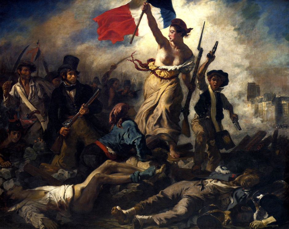
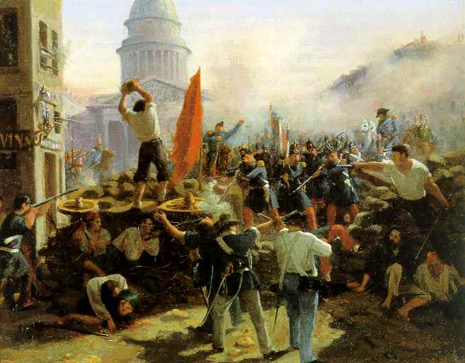
I’m going to start with art critic Charles Baudelaire’s quip about painter Horace Vernet. Writing in in The Painter of Modern Life in 1863, Baudelaire accuses Vernet of being ‘a veritable journalist, not an artist’. Baudelaire criticised Vernet’s paintings of recent history as being too accurate, rejecting Vernet’s work as reportage rather than art since ‘he just paints what he sees’. Baudelaire believed that art should be truthful but imaginative.
Baudelaire wanted artists to paint modern life, and to find the grand and the epic in it. It is no wonder then, that he championed Delacroix’s imaginative vision of the barricades rather than Vernet’s observational one. Delacroix stayed painting in his studio in the 1830’s uprising, while Vernet went out to see, and draw, the violent insurrections of 1848.
DELACROIXVERNET
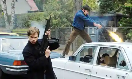
Journalism and Baader Meinhof Complex
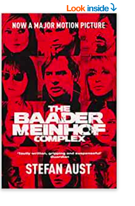
Book by Stefan Aust – read it it is great!
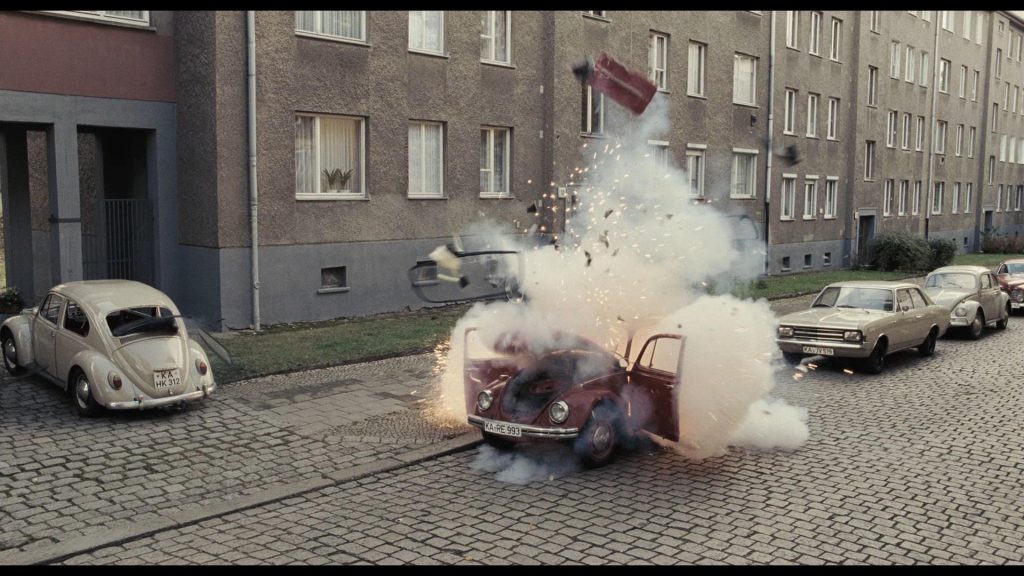
Uli Edel’s Baader-Meinhof Complex chronicles the Red Army Faction in 1960s and 70s Germany, events that happened during his youth. The Baader-Meinhof Complex is a straightforward adaption of journalist Stefan Aust’s factual book of the same name. Aust, who knew several RAF members and has been a journalist since that time, has done extensive research on the subject and wrote a first draft of the script. Producer Bernd Eichinger and Uli Edel finished Aust’s screenplay.
The film is an example of high realism and devotion to historical accuracy. However, the film’s pacing resembles that of the thriller genre, and Edel employs stylistic visual approaches that may be called ‘painterly’.
The Red Army Faction (RAF) committed bank robberies, bombings, kidnappings, and assassinations. The film follows Ulrike Meinhof, Andreas Baader, and Gudrun Ensslin from their formation to their capture and deaths at Stammheim jail. The film attempts to be a factual yet dramatic recounting of a still-contentious and divisive recent history.
At the time of the events shown in the film, Stefan Aust was a colleague of Ulrike Meinhof at the magazine her husband edited. Aust is therefore both an investigative journalist and an inside witness to the early stages of Meinhof’s radicalization. The film faithfully follows the timeline of Aust’s book, from Meinhof’s criticism of the Shah of Iran’s visit to Berlin on 2 June 1967 and the subsequent violence up to the 18 October 1977 deaths of Baader and Ensslin in prison. Aust did not only research and investigate the events, but he was also a direct witness to many of them. Possibly because of his links to the German left at the time, he obtained many candid interviews with former members of the RAF, reflecting on their actions and motivations.
Truth and Accuracy
The Baader-Meinhof Complex is based solely on investigative journalism, unlike other more fictionalised accounts. The film’s judgements are mostly agreed upon by experts, and all the characters are real. It is important to understand the film’s relationship to the facts, and how the journalistic approach and the dramatic approach cohere. Yet the film is no mere recitation of facts. It operates on the viewer emotionally, through scenes which adhere faithfully to the factual account but are visually presented as thrilling and, at times, sublime.
This unusual factual thriller does not trade historical accuracy for drama.
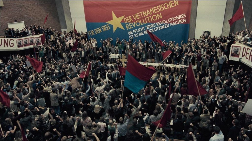
the students protest the Vietnam War in 1968
Writer-producer Bernd Eichinger stressed that he is not interested in the why but the how of the RAF, which lets the deeds speak for themselves and offers multiple interpretations. Edel and Eichinger achieve this by combining both ‘art’ and ‘journalism’ approaches, through an engagement with painterly visuals as much as through detailed attention to authenticity.
Director Edel and DP Rainer Haussman adapt art historical images into the mise en scene, suffusing the realism of the journalistic adaptation with a sense of the sublime. They create moments that ‘evoke’ paintings.
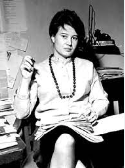
Ulrike Meinhof
Meinhof in actionthe real Ukrike MeinhofMartina Gedeck
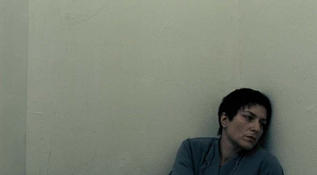
The Baader Meinhof Complex is a film about a journalist. Although the film is ostensibly about a group, for much of the narrative it principally follows Ulrike Meinhof’s gradual transformation from a left-wing journalist into an active, armed radical of the Red Army Faction.
The film mainly follows Meinhof’s radicalization and introduces Andreas Baader and Gudrun Ensslin, who are less important in the story. The first part of the RAF story—radicalization, violence, and capture—is exciting. The rest of the story involves their detention, dramatic trial, and mysterious deaths in prison.
Aust’s research shows that the thriller approach is terrifyingly appropriate for the first half of the film. ‘Baader arranged it so our heroic political beliefs flew right out of the window, and there we were, right in the heart of a thriller,’ said Beate Sturm, a former member. “You just slip into that sort of thing,” Sturm said about joining the RAF. Once in, the group had momentum. ‘As we felt we knew we got into all this for the correct political reasons, we relished the thrill of it too,’ Sturm says to Aust.
However, the actions of historical individuals (and what drives them) is something that cannot really be subjected to the rigours of ‘authenticity’; even the diaries of Meinhof, mined by Aust and Edel, cannot simply be replicated on the screen. It is left to the visual design to convince the viewer that what they see is ‘true’.
Painting adaptation
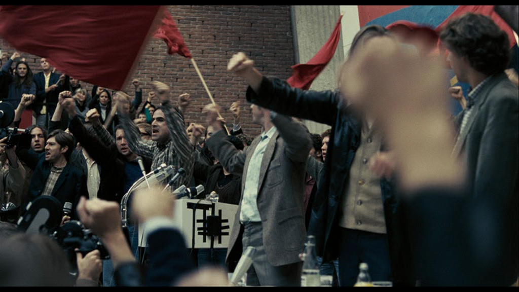
The most striking aspect of the film is not simply its desire for visual historical authenticity and the methods used to achieve it, but the visual structure of the film. Edel and Haussman’s attention to period authenticity binds the two parts of the film stylistically, but once the characters arrive in Stammheim, the pace slows and the contrast between physical and psychological violence becomes stark. However, the first portion’s dramatic and well realised set-pieces capture the audience and prepare them for the second part.
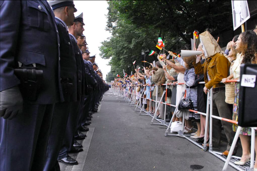
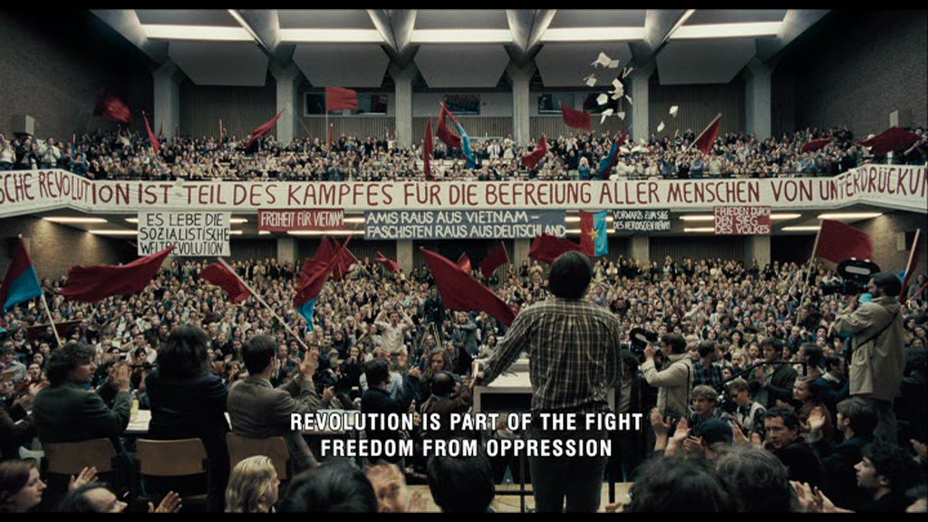
The main set-pieces are visually spectacular, fast-paced, and audio-visually impactful. The first is reenacting the 2 June 1967 protest against the Shah of Iran’s visit to Berlin. Second is student leader Rudi Dutschke’s speech at a Berlin University rally against the Vietnam War. The third is the mass protest at the Axel Springer publishing company in Kochstrasse, 11 April 1968, following the attempted assassination of Dutschke.
Tragic Emotion
Edel calls the RAF a “German tragedy”. Tragedies evoke strong emotions. Edel says in an interview, ‘I don’t think you can grasp anything at all until you can understand it emotionally. ‘I don’t believe in a purely rational analysis of things. I believe that a purely rational analysis must always be supported by an emotional analysis as well’.
This sense of tragedy is conveyed less through the story, which in its journalistic form is fairly grubby and complicated, than through its visual reference points. By faithfully re-creating the historical event while increasing the emotional charge of the scene, culminating in a moment meant to evoke the sublime to transport the viewer emotionally the film moves from journalistic realism to painterly grandeur.
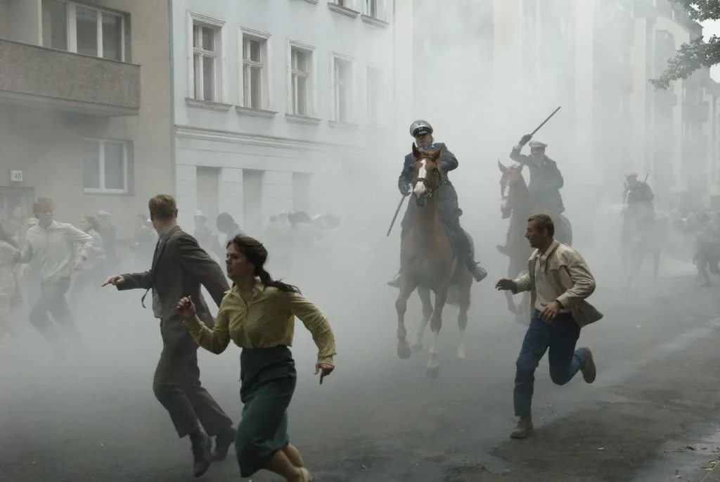
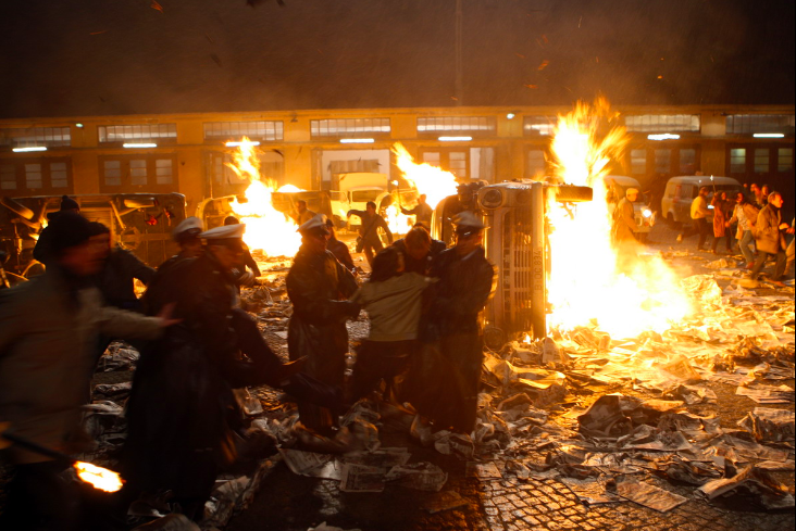
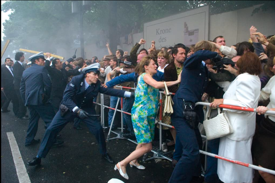
2 June 1967 The Bismarckstrasse riot reenactment.
recreation of Benno Ohnesorg murder by policereportage of Benno Ohnesorg murder by policereportage from the time
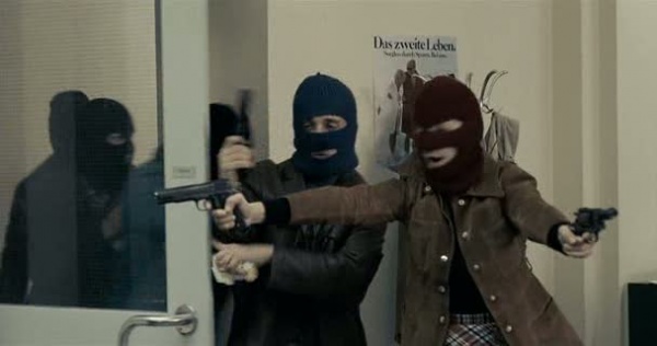
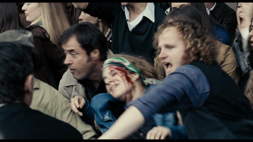
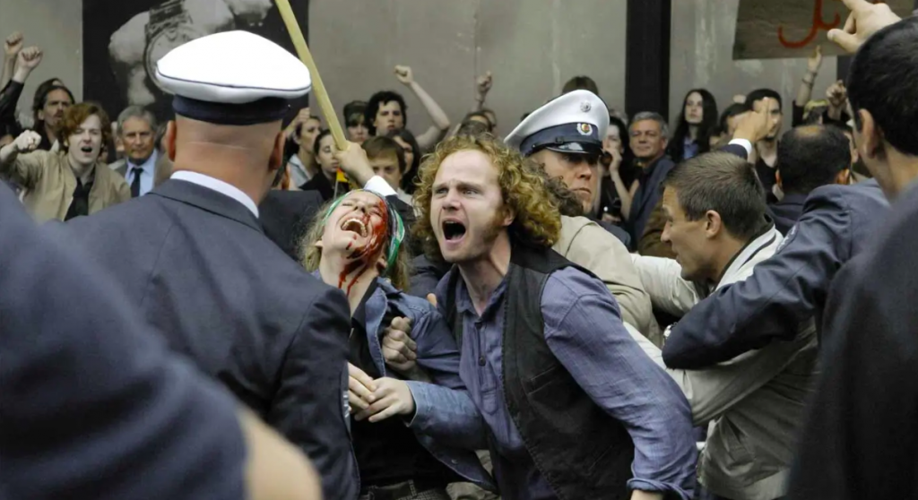
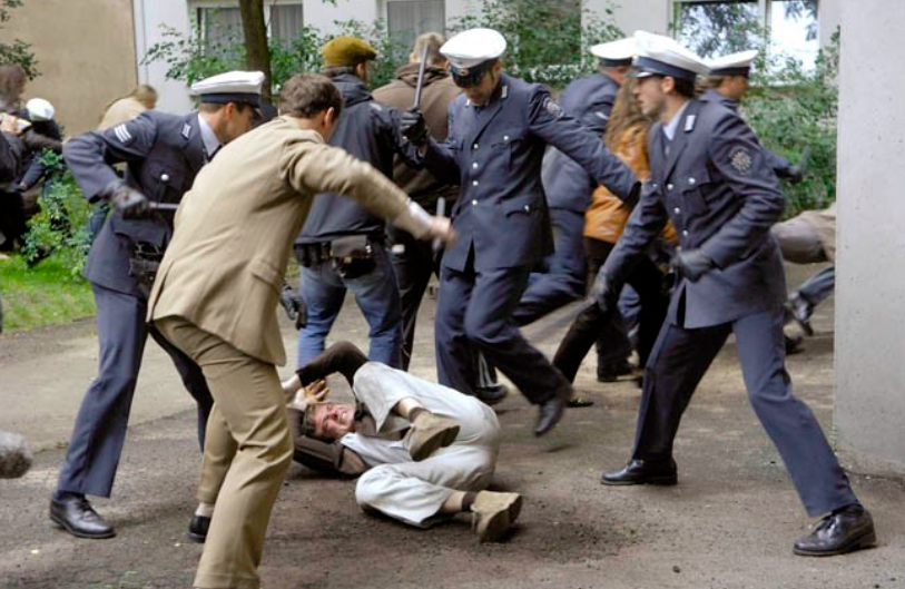
First AC Astrid Meigel said four cameras were used on Bismarckstrasse, ouside the German Opera House, to capture the demonstration’s violence and panic: one held-held, two Steadicams, and one studio camera on a dolly. DP Klaussman says, ‘we wanted to get specific images that have appeared on the original news coverage of the event. You have to start with the big shots, with everybody there, and then you move closer and closer until you’re getting little moments like the young girl being crushed against the barrier.’ The constantly moving, eye-level camera makes the viewer feel viscerally frightened. All cameras are at victim eye level. We run alongside young and elderly people alike, see them smashed in the face. However, news footage of the events shows a big discrepancy between what the fiction film audience sees and what the news cameras filmed. Klausmann’s cameras are always “inside” the action, beaten and trampled by police, unlike the news cameras which stand back like Vernet’s observation of the barricades. Finally, one of the protestors is shot dead. In short, the scene is shocking and distressing: state violence wreaked upon unarmed civilians.
The Baader Meinhof Complex depicts the 2 June 1967 as a “massacre of the innocents,” one of the most potent themes in art history. Flemish painters turned the New Testament tale of the Massacre Of The Innocents into a horrific condemnation of state brutality against civilian populations. Pieter Bruegel, Peter Paul Rubens, and Cornelis Van Haarlem are three of the most striking painters of the topic. Their images show state aggression against unarmed civilians.
Peter Paul Rubens’ version immerses the viewer. Dead babies are piled up as living ones are brutally manhandled. A soldier lifts an infant as if to smash him into the ground. One woman holds the soldier’s sword blade and bites his hand, while another scratches his face. It’s a horrifying vision of state violence breaking families apart, yet it shows women fiercely fighting back. The image astonishes modern viewers. The Biblical “massacre of innocents” depicts state aggression, seen in the Roman soldier’s helmet at the upper part of the picture. It’s a depiction of horrible brutality, visceral assault of women and children, injustice, and pathos.
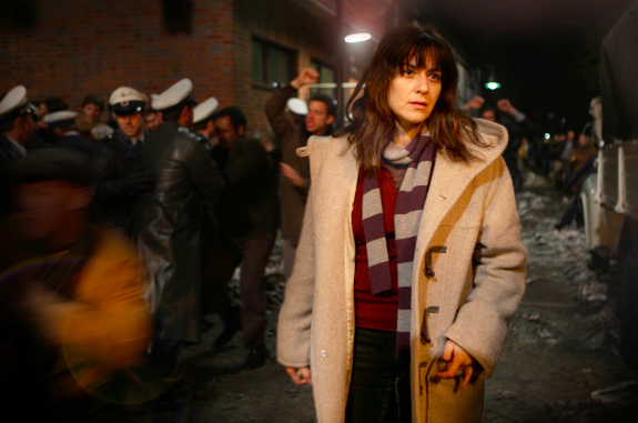
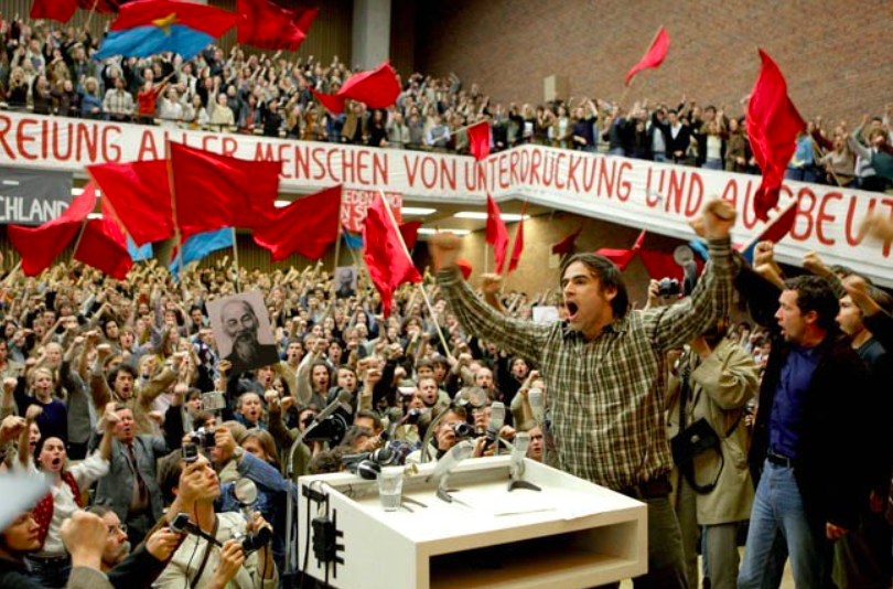
Meinhof Crosses the line
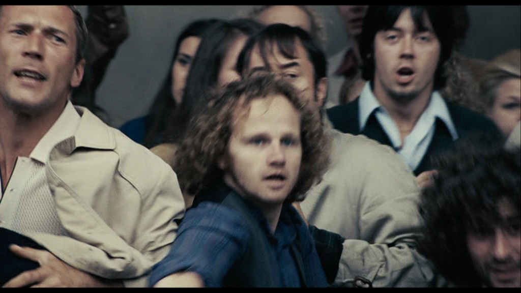
After Rudolf Dutschke was shot in April 1968, the Axel Springer publishers were attacked across West Germany. Springer denounced students and young people, and the students denounced Springer and all its publications. Many blamed Axel Springer for the assassination attempt. West-Berlin publishing house headquarters saw some 3,000 protesters. They chanted, lit fires, and tossed stones and Molotov cocktails. In the film, Meinhof becomes involved, instead of observing like a journalist. The scene shows her ‘crossing the line’ from observer to participant.
Religion
The media footage of the event shows the protesters gathering in daylight giving speeches and massing in great numbers but but Edel shows Meinhof arriving in the evening after the fires have been started. The effect then is of a highly dramatic chiaroscuro, so different to the televisual images. Footage from other West German cities where Springer officers were attacked do show nighttime images but as you can see they tend to depict the authorities more than the perpetrators. Edel’s vision was quite different: he wanted to show the rioters’ perspective.. In order to do this, he unsurprisingly turns to Delacroix rather than Vernet.
the excitement and exhilaration of riot
The third example I’ll show you comes from same scene but offers an entirely different viewpoint on the RAF story and invokes a different kind of artwork.
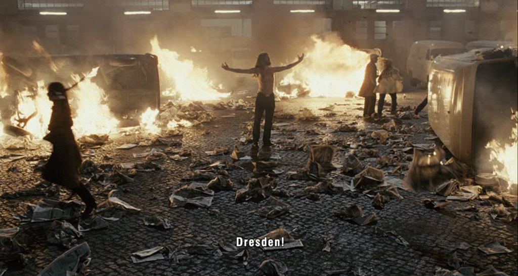
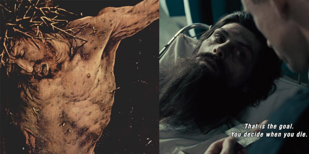
Like a scene from Hieronymus Bosch’s Hell, the demonstrators’ bonfires shadow everything against the night sky. Meinhof stands silently, taking in the commotion and frenzy around her. Bathing in the chaos and frenzy all around her, a growing euphoria is clear upon her face.
She is then grabbed and dragged to the police cars. As she moves out of the frame, someone shouts. The camera pans over a hellish wasteland of turned-up cobbles, strewn newspapers, and burning delivery vehicles. A bearded, bare-chested young man with long dark hair stands, holding his arms out in a crucifixion pose amid the commotion. The camera comes in for a medium close-up as he stands Christ-like, silhouetted against the fires, shouting “Dresden! Hiroshima! Vietnam!”
The scene’s end, with the Christlike figure howling in the flames, cannot be compared to be situated in relation to Delacroix’s revolutionary heroics. We must look to older works from an earlier worldview. In fact, this figure seems confusing because the film doesn’t show any theological standpoint.
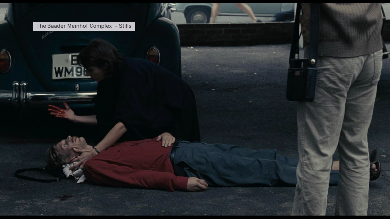
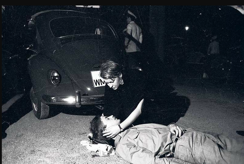
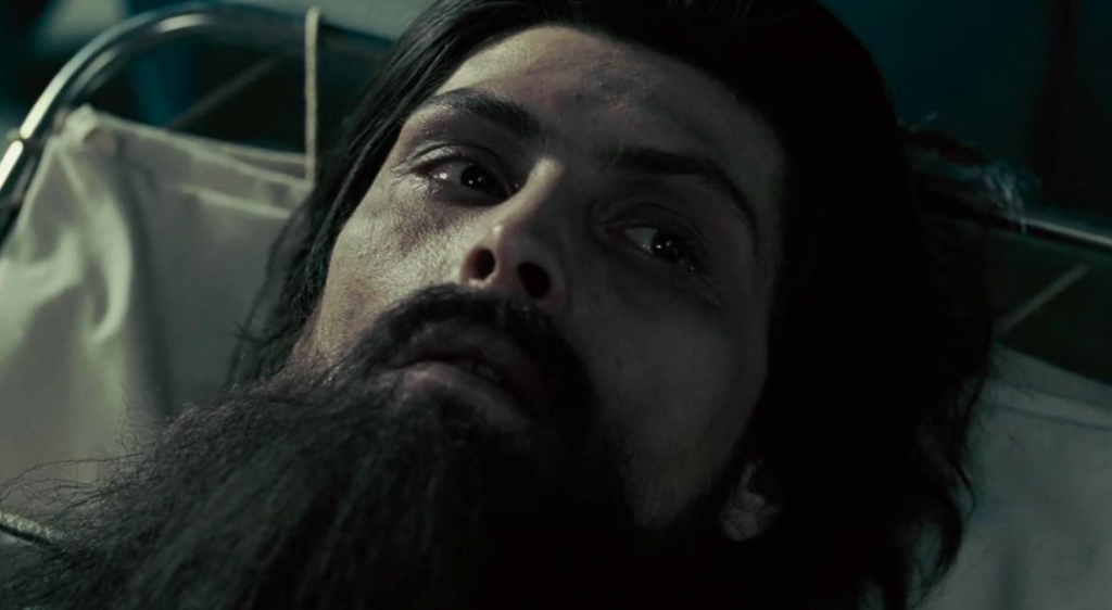
If the Springer riot is Meinhof’s own moment of ‘holy self-realisation’, the later prison scene shows the starvation death of RAF member Holger Meins as skeletal, tortured features of Grunewald’s Christ in the Isenheim altarpiece.
What is the meaning of these quasi-religious references?
The 1978 film Germany in Autumn interviews RAF member Horst Mahler in prison. He discusses “evil” and personal responsibility in dissident groups. He asks ‘how is it that a person like Ulrike Meinhof is willing to kill, or at least accept it as a possibility?’ … ‘moral degeneration of the capitalist system’ is completely apparent, and those who act within it do so in a corrupt manner, ‘we judge them morally, condemn them, and, based on this moral judgment, we recognise them as evil’. Mahler concludes ‘Therefore it is justified to destroy it as evil, even if it is in human form. In other words, killing people’.
Stefan Aust observes that ‘for me, the whole struggle from the very beginning of my research was realising that the RAF had a quasi-religious character more than a rational political character’. Therefore, by framing the revolutionary cause as a Christ-like self sacrifice, to deliver us from evil, Edel gets right to the heart of how the radicals saw themselves. For all their talk of freeing themselves from the shackles of the historical past, and joining in with the oppressed of the world for new internationalist world socialism, they remained culturally embedded in the Judeo-Christian mindset with which they were brought up. Because they resisted evil, the RAF convinced themselves they were good. Because the RAF was good, their opponents were evil.
Using the visual references to the massacre of the innocents and to the suffering Christ – images embedded in Western art and therefore in the Western worldview – in the context of a violent riot and the hunger-striking prisoner, Edel offers a visual manifestation of what Horst Mahler articulates: the theological worldview of the modern revolutionist.
Conclusion
To sum up, the realist style is still dominant in each set-piece and carries on throughout the film. But in the set-pieces, we see realism move toward the sublime, in the depiction of the terror of violence, and in the Springer scene, catharsis. Each of these scenes visually maps onto an existing visual motif in painting, and each of the paintings communicates something about contemporary events. Moreover, each painting manipulates the mise en scène in order to indicate something of the sublime: the terrifying violence of the massacre fo the innocents paintings, Delacroix’s romantic exhilaration of revolutionary direct action.
The Baader-Meinhof Complex’ high-concept ‘the RAF story as a thriller’ adapts the journalistic text faithfully, then reaches beyond it, locating the emotional and artistic impulses within the film’s mise enscène.
Though faithfully following Aust’s journalistic account, and adhering to both the newsgathering images and the published histories on the subject, Edel’s film manages to combine the exactitude of the ‘veritable journalist’ and the intensity sought by Baudelaire’s idea of ‘plunging’ into the world. The film blends correctness and authenticity with drama and affective engagement. This tension between the faithful recounting of ‘what happened’ and the desire for imaginative and interpretive drama through the invocation of the sublime, is at the heart of The Baader Meinhof Complex.
Is the film ‘realistic’? Yes it is. It follows, more than most films, the established facts and accepted judgements.
Is it ‘real’? That is impossible to judge. No film can recreate the past. Every person that remembers the time – including the producer and director – will remember it differently. The ‘real’ is always temptingly out of reach. We can only imagine, and tell stories.
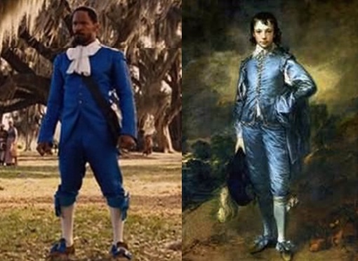
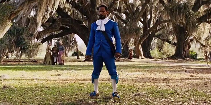
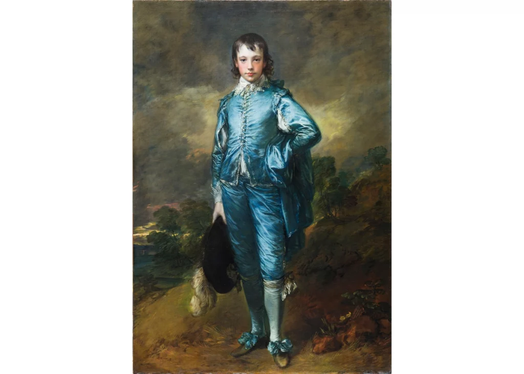
The western was the film genre that brought the heroic figure together with the overwhelming yet splendid landscape. This case study looks at a subversion of that cinema genre through an unlikely relationship: English portrait and landscape painter Thomas Gainsborough (Blue Boy, 1770) and American filmmaker Quentin Tarantino (Django Unchained, 2012).
Quentin Tarantino has often been referred to as the archetypal “postmodern” filmmaker. His films bear the hallmarks associated with postmodernist approaches: appropriation of ideas, images, and texts from different sources; referencing other movies, books, and art; pastiching established genres; conflating popular culture and high culture. In his later films, Tarantino subverts existing genres, including established trash and schlock genre forms, and through the process of subversion seeks to make a serious point.
Thomas Gainsborough, the eighteenth-century portrait and landscape painter, could not be further apart from Quentin Tarantino at first glance. Yet Gainsborough was subversive in many ways. Like Tarantino, he broke new artistic ground and challenged established artistic forms. However, until Django Unchained, it would have been ridiculous to imagine a comparison between Gainsborough and Tarantino, or even to discuss them within the same sentence. But in that film, Tarantino and his design team (J. Michael Riva and Sharen Davis) appropriate a key element of one of Gainsborough’s most popular and most widely distributed painting, The Blue Boy. It is from this starting point that we will look at this case study of Django Unchained and Gainsborough’s Blue Boy.
The Blue Boy was painted before Gainsborough moved to London. Born and raised in a lower-middleclass family in rural Suffolk, he moved to the spa town of Bath as his portrait practice developed. The problem for Gainsborough was that he preferred landscapes. He liked painting people—skin tones, drapery, and costume—but, with the exception of certain female clients, he disliked painting portraits of the type of people who commissioned him. We know this because in his letters he complains about his rich, arrogant, empty-headed clients, and says many times over that he wishes he could just go to the countryside and spend the rest of his life painting landscapes and common folk. (His own favorite was The Woodsman, 1788, a portrait of a poor forest worker.)
It is not unusual for people to dislike their day job and wish to be doing something else. But Gainsborough’s ability to create real likenesses of his subjects made him successful. He rejected the current fashion of painting his subjects dressed up as mythological beings; he wanted to paint people in their own clothes, looking as they would if you met them. One of the trendiest fashions in mid-eighteenth-century England was to be painted wearing the court costume of the previous century, in the style of Dutch painter Anthony Van Dyke at the court of King Charles I. Van Dyke’s paintings were widely copied; all decent painters understood that they should be able to make a Van Dyke to order.
Van Dyke painted his aristocratic subjects wearing elaborate silk and lace suits, one of the most influential being Lord John Stuart and His Brother, Lord Bernard Stuart (1638). In the painting, Bernard Stuart is wearing a fabulous pale blue satin suit, though most of it is obscured by a heavy silver cape.
Normally this is the kind of portrait that Gainsborough would have scoffed at replicating. But two years previously he had been elected a founder member of the Royal Academy of Arts. It was never an easy relationship; Gainsborough felt like an outsider with something to prove. He decided to challenge the claim of the Academy’s head, Sir Joshua Reynolds, that blue colors should be used only as accents, not in the main mass of the picture. He painted a mass of blue, an exercise in color and light reflecting on silk, using layers of different blue pigments: lapis and indigo, cobalt and turquoise, together with charcoal and creamy white, and sent The Blue Boy to the Royal Academy’s 1770 Salon.
But who was the blue boy? He was not an aristocrat or theater celebrity who would normally command an Academy-level portrait. He was Jonathan Buttall, a good friend of Gainsborough and an iron merchant in London. It was not a commissioned portrait: Buttall posed for Gainsborough as a friend. Buttall was far outside the circles of power; he could never have worn court dress. Therefore, The Blue Boy is a subversion. It is not only a painting of an eighteenth-century man in seventeenth-century dress; it is an aristocratic portrait that portrays a middle-class man.
The painting became the talk of the Academy, and its success spurred the painter to move to London two years later. He was commissioned by the royal family, and his success enabled him to take more time out to paint his beloved landscapes.
But it was not that simple. Soon after arriving in London, Gainsborough fell out with the Royal Academy and spent the rest of his life in rivalry with Joshua Reynolds. He would probably be surprised to know that The Blue Boy remains his most popular and most influential painting—though not his best—while to him, it was a caprice. While Jonathan is not portrayed heroically, he stands for the bourgeoisie, excluded at that time from political power and influence, which was still in the hands of the aristocracy. Dressing him in Van Dyke costume must have been a bit of a joke, a subversion to slip into the heart of the Establishment, the Royal Academy.
By the late nineteenth century, The Blue Boy was an internationally popular print and is said to have inspired the 1919 film Knabe in Blau by F. W. Murnau (now thought to have been lost). Quentin Tarantino and costume designer Sharen Davis likely first came in contact with the picture as a kitsch print; it was ubiquitous throughout the 1970s, appearing in many inexpensively printed versions. Blueboy was also the name of a US gay porn magazine of the 1970s.
Tarantino, like Gainsborough, started as a rank outsider. He has talked many times about his lack of any insider connections to the movie business, his total lack of power or influence when he started his career. It was hard. “Pauline Kael used to say that Hollywood is the only town where people ‘can die of encouragement’ and that kind of was my situation,”5 he says.
Like Gainsborough, Tarantino has to date shown no intention of following an established career path. Despite his love of popular culture, he has not made a studio franchise picture. He regularly takes a drubbing from critics, who decry his unabashed love of trash cinema, and those who criticize his films for violence.
Django Unchained is in part a road movie; as production designer Michael Riva says, it is Django’s psychological journey, but it is also a geographical journey through landscape. Django and Schulz arrive in Tennessee and head to a haberdashery, where Django is invited to pick out a costume in order to play the part of Schulz’s valet. The next shot is of Django wearing a bright blue suit, styled in a vague pastiche of seventeenth-century fashion, the archetypal Blue Boy.
The connotations are rife: The Blue Boy is a well-known kitsch print, but the painting resides in the important Huntingdon Museum in Los Angeles. “Boy” was a condescending term used to address all African American males regardless of age, particularly in the South.
We first see Django in his blue suit from the side, riding a horse through a landscape, a cotton field. The composition of this shot is itself a nod to the subgenre of the equestrian portrait.
Van Dyke made a famous equestrian portrait of King Charles I, which was repeatedly copied, and Gainsborough made variations on Van Dyke (as exercises, or simply to pay the bills). And the David portrait of Napoleon is an equestrian portrait. Equestrian connotes aristocrat and hero. But in that costume? Not yet.
The blue suit makes Django stand out, command attention, and is ineffably striking. Riva notes that “color is a really important to me, it’s a mood establisher.”7 The intense blue (much brighter than The Blue Boy’s silk) acts paradoxically as a red flag to the white supremacists he encounters. But both Jonathan Buttall and Django are in costume; Jonathan could never dress like that to do his daily business as an iron dealer. Django soon equips himself in what Riva calls “warm nicotine colors,” in more practical—and stereotypically “western”—garb.
The Blue Boy motif is incongruous in a western. Yet, as Tarantino points out, “One of the things that’s interesting about Westerns in particular is there’s no other genre that reflects the decade that they were made and the morals and the feelings of Americans during that decade than Westerns. Westerns are always a magnifying glass as far as that’s concerned.” He notes that “Westerns of the ’50s definitely have an Eisenhower birth of suburbia and plentiful times aspect to them. . . . the late ’60s has a very Vietnam vibe to the Westerns leading into the ’70s, and by the mid-70s, you know, most of the Westerns literally could be called Watergate Westerns because it was about a disillusionment and tearing down the myths that we have spent so much time building up.”
Django is a western that subverts the dominant white male hero in a wish fulfillment revenge fantasy that forces the audience to confront race and slavery. It is probably too much to consider The Blue Boy as a wish fulfillment class fantasy. Perhaps we should consider Django Unchained’s Blue Boy motif to be a parody, with its political connotations, while Gainsborough’s Blue Boy is an apolitical pastiche. Yet Gainsborough’s own letters bear witness to his private discomfort with the upper class.
Tarantino and Gainsborough share the status of being both insider and outsider. Neither man belonged to an influential coterie or was a member of an art or film dynasty. Both gained success on their own terms, even if Gainsborough sometimes whined about his clients.
You don’t actually need to know anything about the Van Dyck paintings or Gainsborough to appreciate Django Unchained. But understanding the art historical provenance of the costume, with its many underlying connotations, can help you see why it is so effective, and how art can be so influential that it manages to be replicated in unexpected places, while continuing its original message.
Gainsborough’s Blue Boy 1770van Dyke, equestrian portrait 1635Blueboy magazine (1974 to 2007)
By the time the Thomas Edison company turned its cameras on Buffalo Bill, the imagery of the American West had been established for almost acentury: a vast empty landscape, with stunning scenery, few people, andpicturesque Native populations. Early western movies were able to use thesepaintings and illustrations to create exciting settings that were alreadyfamiliar to audiences. Early American cinema audiences were almost entirelybased in urban areas, particularly the immigrant-populated cities of theeastern seaboard, who only saw the West in the cinema and in art.
The western is the most landscape-centric film genre. Indeed, the landscape defines the western completely, as thestories are inextricably linked to their location. But the visual imagery of thewestern is drawn almost completely from painting: the sublime vision, dramatic sunsets, a sense of isolation, emphasis on topography such as mountains, rivers, and lakes. Figures are often depicted as almost miniscule.
But the paintings are themselves nostalgic, showing a vanishing way of life, hiding the reality of tourism and the squalor that existed in both Native encampments and settler villages. The popular media of the time did not elaborate on these things.
The western is a truly American genre, in painting and in cinema. The covered wagon trains, the cowboys, the Native American camps, and the monumental landscapes of Colorado, the Rocky Mountains, and the Great Plains belonged only to America. The appeal of the western was that it could be a shared cultural experience, bringing together immigrants from the four corners of the earth to participate in an “American” story. Exported, the western film made America a glamorous and exciting place.
The western film tries to have the best of both worlds: a stunning yet nostalgic landscape, almost completely unspoiled by humans, yet, paradoxically, the western is full of stories of human heroism, depredation, and betrayal. In the next chapter we will look at artistic depictions of heroism, and how they feed into cinema.
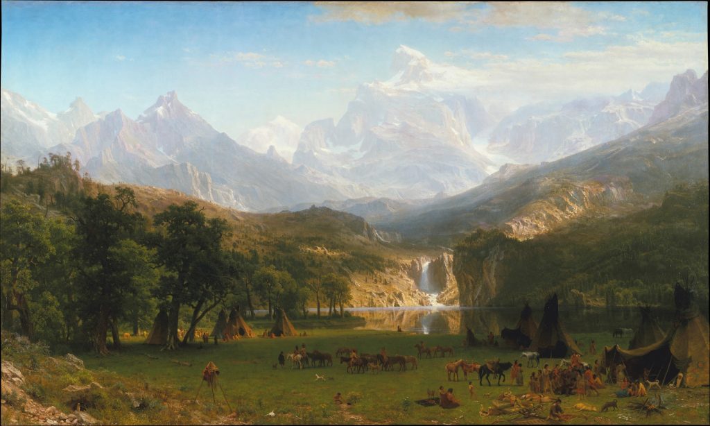
The Rocky Mountains, Lander’s Peak Albert Bierstadt 1863 Metropolitan Museum of Art
Although the road movie may seem to be the quintessential American genre, its roots lie in Europe and in a literary tradition known as the picaresque, in which the plot is structured as a journey. In cinema, by the middle of the twentieth century, the western began to merge into the road movie. The two have much in common: the movement of characters between civilization andwilderness, the contrast between civility and barbarism, and the wide open landscape. The road symbolizes and embodies America’s historical frontier ethos, recurring as a persistent theme of American culture.
The western had always offered a specific conception of American national identity typified by individualism and aggression. In the linear narrative structure of the road movie, these characteristics become concentrated and codified. The landscape of the road movie, as with the western, is the inexorable “third character” of the film—it both mirrors and influences the action and the mood.
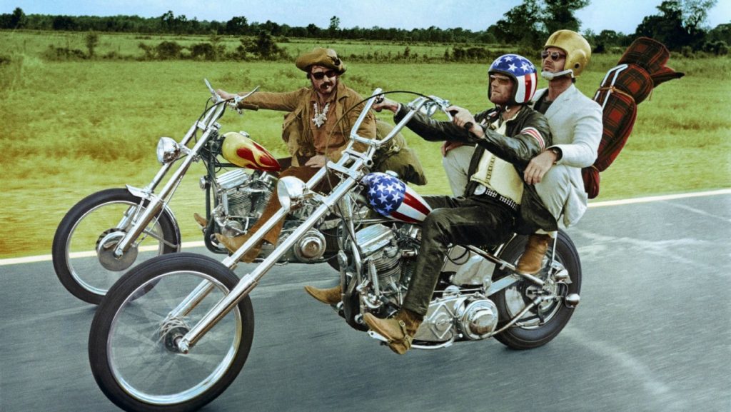
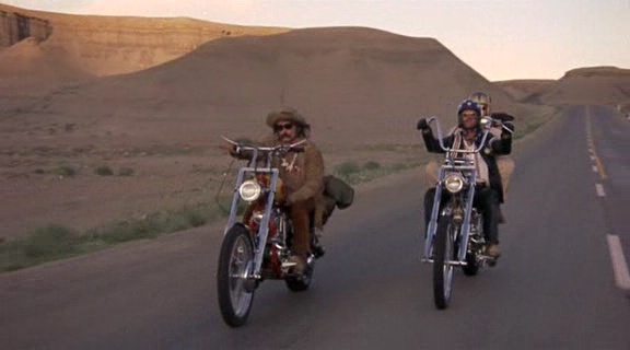
Easy Rider, 1968 Dir. Dennis Hopper, DP Laszlo Kovacs
“It’s about 2 guys riding across the west, John Ford’s west, only they’re going to go east.” (Peter Fonda)
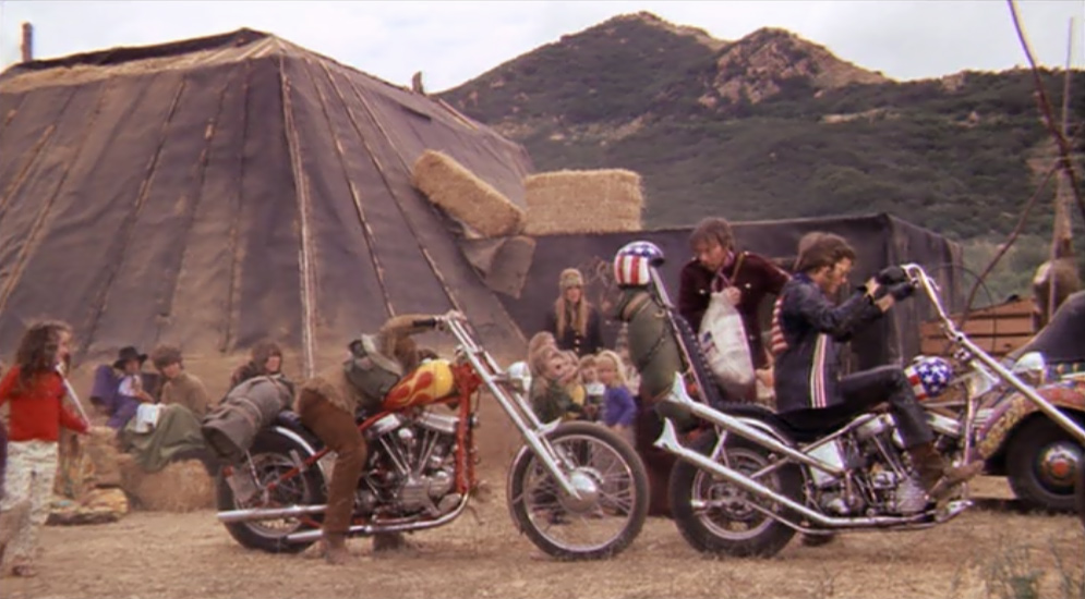
Two young men with motorcycles cut a lucrative drug deal and then ride across the USA to the New Orleans Mardi Gras. On their way they visit a hippie commune and a Mexican American farm, befriend a civil rights lawyer, and encounter intolerance and violence. Peter Fonda and Dennis Hopper wanted to make a movie that would take the pulse of the era, a time convulsed by the Vietnam War and the perceived “generation gap” between the conservative older generation and the youth.
Easy Rider contrasts “America the beautiful” with an ugly America: the beauty of the landscape against the brutality of its inhabitants. But not all of the landscape: the film idealizes the Southwest, with its dramatic desert vistas, populated by hospitable, spiritual folk—Native Americans, Hispanics, hippies and indicts the South. “In the Southwest the protagonists enjoy the freedom of the road, the hospitality of those they encounter in the beauty and mystery of the region’s wilderness.”
Conversely, the South, despite occasional glimpses of verdant beauty and Old South plantation houses, reveals African American poverty and a despoiled industrial world of oil refineries, cheap cafes, and ignorant bigots.
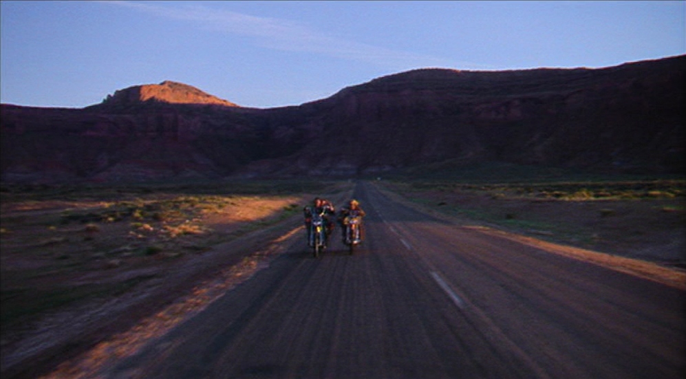
The movie was made on location, following much of the famed old Route 66 through California, Arizona, New Mexico, and Louisiana, and a great deal of it was shot on the open road by DP Laszlo Kovacs. Fonda and Hopper rode their motorcycles on the road, accompanied by the camera car, a 1968 Chevy convertible with the backseat taken out and a pinewood floor where the tripod was fixed. This allowed Kovacs to use a telephoto lens to offer many differentpoints of view while aligning the movement of the bikes, capturingthe landscape from the bikers’ perspective. “Laszlo was able to give us a sense of freedom of being on the road, of being able to experience America for the first time . . . he was able to be that metaphor of freedom”
(Cinematographer Ellen Kuras).
Kovacs, a refugee from the 1956 Soviet invasion of Hungary, recalls first crossing America by bus, sitting in the front seat. His first impressionof America was that it was a “devastatingly beautiful country . . .it left such an impression on me [. . .] that later on I was able to use it in my movies.” The trip also “taught me one lesson that the environment the background is so important it has to be a third character because it tells so much about people who live in it.”
The landscape is indeed a character in Easy Rider. As Fonda points out, the film reverses the classic western route of east to west.
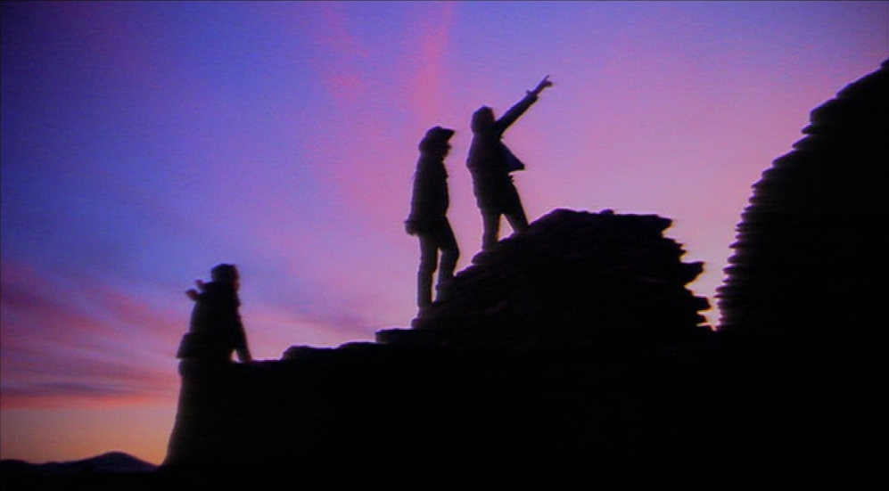
The journey starts in hope, with stunning sequences in the Painted Desert and in Monument Valley (interestingly, the film crew left New Mexico and passed right through Texas; if they shot there, none of the footage is in the film) and ends on a nondescript roadside on the banks of the Atchafalaya River in upstateLouisiana. Kovacs invoked created romanticism through the use of lensflare; previously considered a grave camera error, Conrad Hall had usedit in 1967’s Cool Hand Luke. Kovacs saw its aesthetic possibility to createwhat he called “rainbows” of light, romanticizing the landscape andoffering a shimmer of hope that is belied by the film’s story.
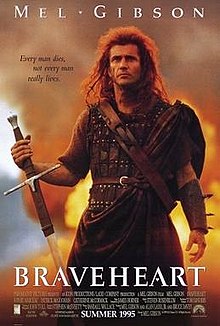
Heroic stories – whether true or mythical, are enduringly popular. This heavily fictionalized biopic of William Wallace, who led a Scottish rebellion against the English King Edward I, was a critical and box office success, winning Oscars for Best Picture and Best Director – in all, a total of five Oscars.
The ideal “hero” model was established in earliest antiquity, in the ancient epics of Gilgamesh, the Iliad, and the Norse sagas. Joseph Campbell in his book The Hero with 1000 Faces shows that similar stories of heroism are present in all societies, at all times in history. It is not a surprise to see that from early times artists have sought to portray heroes and heroic acts. Heroes in paintings are not meant to be realistic; they are heroic. What about heroes in films?
Braveheart in Action
The old-fashioned notion of hero was taken up immediately by cinema, particularly during Hollywood’s Golden age. The appeal of the heroic character endures: some of the most popular include Indiana Jones, Ripley in the Alien films and Neo in the Matrix films. Neo’s partner in The Matrix, Trinity, performs a role similar to the Greek goddesses who help (and often become lovers with) heroes like Odysseus, Perseus and others. Trinity also has elements of the powerful goddess Diana the Huntress (Greek Artemis), a popular subject in Graeco-Roman sculpture. Wearing a tunic and carrying weapons, Diana seems quite dangerous (see the Diana of Versailles from 200 AD in the Louvre). But later paintings tend to show her nude and sexualised (e.g. Titian’s Diana and Actaeon, 1556).
Diana of Versailles, Wikipedia
Napoleon Crossing the Alps (Napoleon at the Saint-Bernard Pass) 1801
This well known painting of Napoleon by Jacques-Louis David is a famous depiction of more recent heroism.
Apparently Napoleon actually crossed the Alps on mule, a far more suitable animal for this kind of tricky and difficult journey. However this wouldn’t do for heroic painting, and so David has portrayed the general not only on a horse, but on a splendid horse rearing up on the edge of a precipice. The staunch general maintains his composure, looking directly out of the canvas and pointing upwards, towards victory and triumph. In the background the Army pushes forward: we can see the war machines being transported up the side of the mountain, and the tricoleur in the lower right. The structure in the picture is striking: Bonaparte is centre and is upright, while the horse and the mountain are on a strong diagonal running from the top left to the bottom right. This arrangements creates a string sense of drama and danger. The diagonal arrangement in the painting that immediately catches the eye. The sensation of wind coming from the rear is shown in both the billowing cape, and also the mane and tail of the horse, indicating the harsh alpine winds that confront the Army. Yet look at the wind direction: these winds are themselves propelling the general, the horse and the Army forward towards victory. David is indicating that even the gods are behind Bonaparte.
David was a staunch supporter of the French Revolution, even its most extreme faction. However when Napoleon took control, David switched allegiances. One might think that David would be disgraced after the fall of Napoleon, but in fact the restored King Louis 18th offered to keep David on as court painter. The artist refused, remaining true to his revolutionary principles.
David was not the first artist to show that portraying real-life people as heroes involves exaggeration and theatricality. David knew that this is not how Napoleon crossed the Alps, but he understood that in order to create a painting with the highest impact to deliver the propaganda message of Napoleon’s overarching genius, strength, power and glamour, it was necessary to create a powerful, glamorous painting. This problem is at the heart of bio-pics which attempt to show the core character in a heroic light. Much of the true story and extraneous detail has to be removed, and any act or gesture made by the central character needs to be reinterpreted as heroic. One of the best examples of this in recent cinema is Mel Gibson’s 1995 film Braveheart, which puts a completely new gloss on the true story of William Wallace. Wallace was a real person, who did rebel but under circumstances rather different to those shown in the film. The film tries to capture historical detail, but there’s no question that it was glamorized for dramatic effect
Films about Napoleon Bonaparte – how ‘heroic’ is he?
Napoleon 1927 Directed by Abel Gance DP Jules Kruger, one of the greatest history films, owing much to both David and Delaroche.
Désirée 1954 Directed by Henry Koster, DP Milton R. Krasner. This film takes a different approach and focuses upon the relationship between Bonaparte (Marlon Brando) and Désirée Clary (Jean Simmons).
Waterloo 1970 Directed by Sergei Bondarchuk DP Armando Nannuzzi (Napoleon played by Rod Steiger)
Youssef Chahine’s Adieu Bonaparte depicts Napoleon (Patrice Chereau) from the point of view of a young Egyptian during the French conquest and occupation of Egypt. In Fench and Arabic – no English versions available.
I have not really said anything about ‘superheroes’ in this article – I have been focusing more on real people portrayed as heroes. I’ll come back ot the topic of hero and superhero in the fantasy genre.
Dutch art of the 17th century has a lot to teach the film maker. During this period, Dutch painters such as Rembrandt, Jan Vermeer, Gerrit van Honthorst, Pieter de Hooch and others developed a kind of painting that combined intense realism with drama and emotion. They did this largely through a deep understanding of how lighting works within the image.
They learned from the Caravaggists, the followers of Caravaggio (the Italian painter who I’ll write about in a later post ) who was one of the first to really demonstrate how careful manipulation of light is one of the chief tools of the visual storyteller.
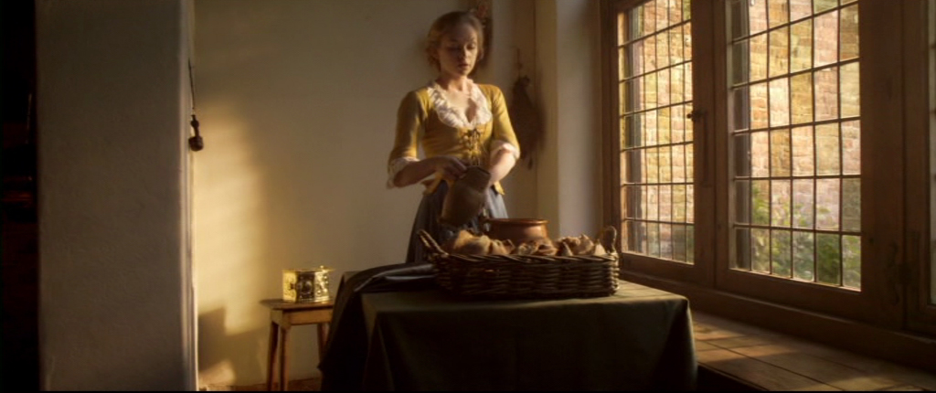
The film Admiral follows the visual style of the Dutch painters and the Caravaggists in using light as a way to model the physical characteristics of the films characters, to create painterly shots, and – as a self-reflexive motif that runs throughout the film – to include paintings within the films mise en scéne* to remind the viewer that the story of the film is deeply connected to the historical world which we chiefly know through the paintings . Here are some examples of how that works in the film:
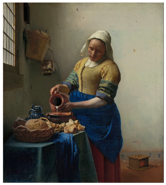
Vermeer’s Milk Maid
shot from AdmiralJan Vermeer The Milk Maid, c.1660
Early on in the film we catch a very, very brief glimpse of the admiral’s maidservant working alone in the kitchen. This shot, which only lasts a couple of seconds, is a recreation of the very famous Vermeer painting The Milkmaid. The recreation of this painting in the film indicates not only a connexion with Vermeer and the Dutch Golden Age’s great achievements in art, but alludes to Vermeer’s representation of domesticity and the beauty of the everyday – which in the context of the film is the one thing that the Admiral is never able to truly experience, because he sacrifices his family life in order to save the nation.
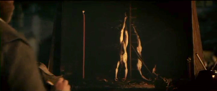
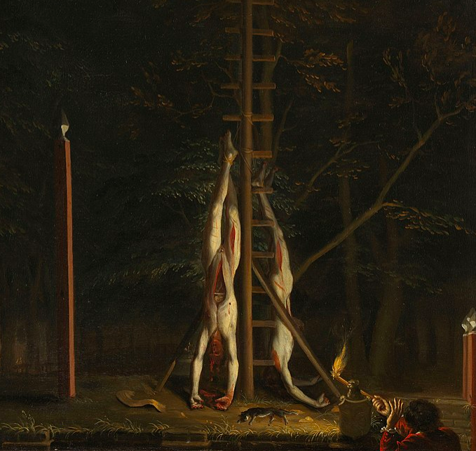
Later (and I don’t want to give away too much of the plot), there is a terrible scene where one of the main characters in the film is killed in a particularly vile way by a baying mob in the streets of Amsterdam The film shows the painting being done from life; as the characters pass through the street, we catch a glimpse of an unseen painter painting the picture. We have no idea whether or not the painting was done in situ (probably it wasn’t).
Jan de Baen painting the painitng below, shot from AdmiralJan de Baen
Realistic Sea Battles
In my previous blog post, I showed you the recreation of the sea battles in the film, and how they are based on the marine pictures by Dutch artists. However, what is particularly interesting is that the nature of movie-making is that you can actually go onto the ships and participate in the battles, rather than – as the painters had to – portray them at a distance. Roel Reiné’s camera brings us right onto the deck in the middle of the fighting.
still from Admiral
At one point we are taken below deck and the lighting of this particular shot is strongly reminiscent of a painting by the Caravaggist Spanish painter Jusepe de Ribera (see below, Ribera’s St Jerome, a good example of the lighting effect).
It is a technique known as tenebrism which is very extreme contrasts of dark and light. This is an important shot because it really brings home to the viewer the human experience of the battle, the terror that the participants must have felt, yet at the same time, the framing of the picture gives us a sense of something spiritual – perhaps the worthiness of the sacrifice.
* mise en scéne is a term that refers to everything that appears in the frame of a shot: what is before the camera and its arrangement: composition, the set/location and all its props, the actors and where they are placed, the costumes, and the lighting. It can also include the use of colour and tonality. The term originated in the theatre and means ‘placing on the stage’. In film, of course, there isn’t a stage; the camera substitutes for the stage. The camera is much more mobile and so the mise en scéne of a film is constantly changing
to learn more about Art History and film, read my book ART HISTORY FOR FILMMAKERS
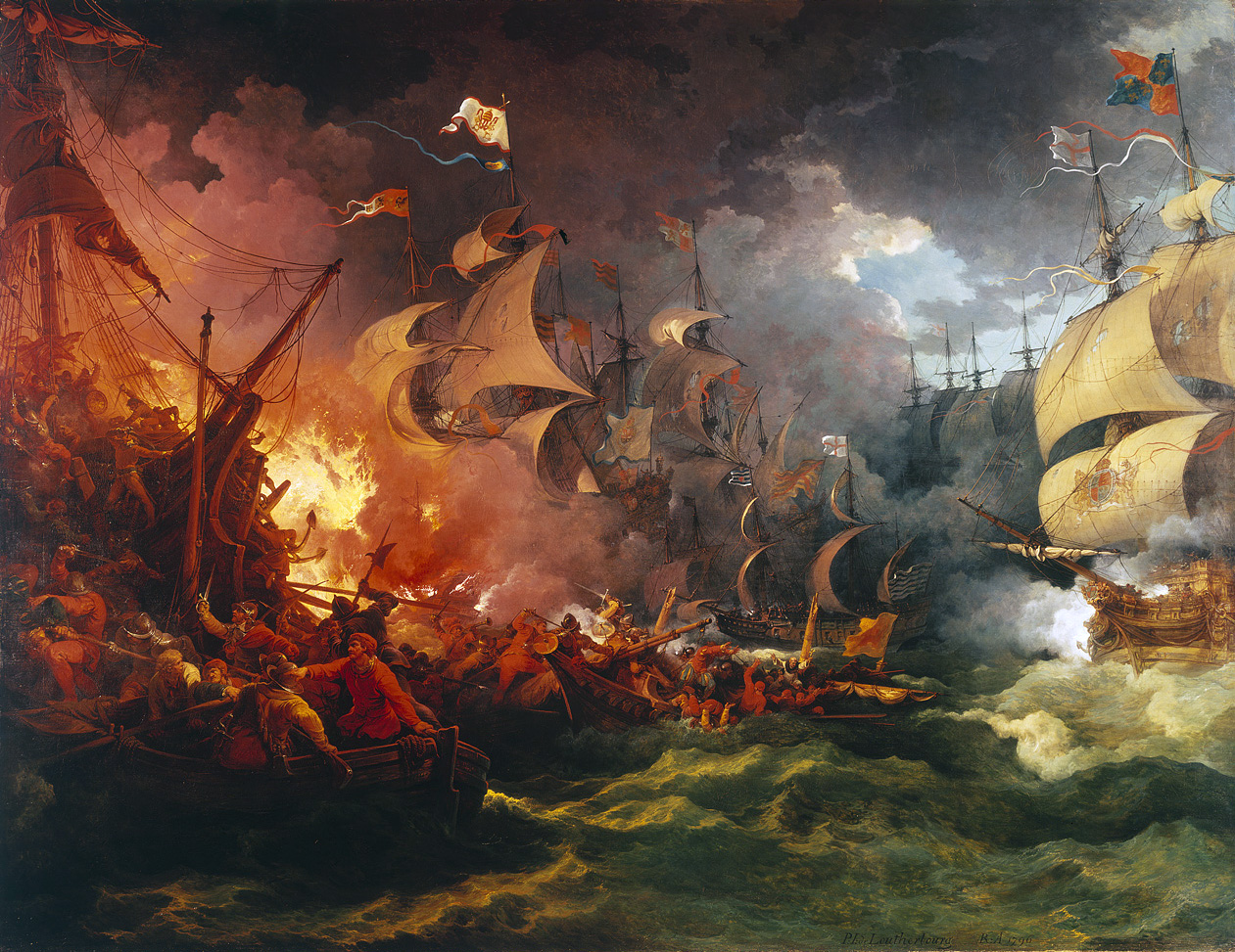
“The Defeat of the Spanish Armada” by Philip James (Jacques-Phillipe) De Loutherbourg.
the defeat of the Spanish Armada, Jacques-Phillipe Loutherbourg 1790
Loutherbourg is a fascinating artist. Born in France, he became a successful painter very young, but moved quite suddenly to London where he reinvented himself as a theatre scenographer. He pretty much invented what we would today call special effects (vfx). He even invented a kind of proto-cinema presentation system. He continued to paint, and this depiction of a slice of English history is a good example of his highly cinematic style: lurid colours, dramatic composition, intense sublime.
Loutherbourg was a keen alchemist and follower of occult practices. For a couple of years he even quit art and became a faith healer. That didn’t really work out.
Amazing, underrated and visually stunning, Loutherbourg’s paintings all deserve another look.
This picture is the best visual representation of the defeat of the Armada we have; the various films that have been made of the event aren’t nearly as evocative. Kapur’s Elizabeth the Golden Age is pretty bad actually in terms of the battle scenes.
It would take until 1979 that a war film would have the courage to create visuals like this painting does – and that film is Apocalypse Now shot by the brilliant Vittorio Storaro.
In terms of fantastic sea battles, the most Loutherbourgian one I can think of is Pacific Rim.
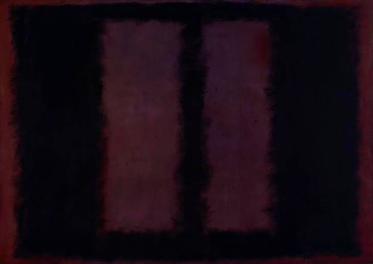
Mark Rothko’s Black on Maroon 1958, at the Tate Modern, might not seem to have anything at all to do with cinema. but I would argue that it (and all Rothko’s work) teaches us a lot about colour. How is darkness made visible? How to differentiate two colour darks and make them both harmonise and clash? How can we use this knowledge in film making? And how to immerse your viewer in the moment of the film by the use of colour? Rothko wanted the viewer to be ‘in’ the painting, not standing looking at the painting, so he made the huge fields of color enormous, overwhelming. And you can feel this strongly in the Tate’s Rothko room.
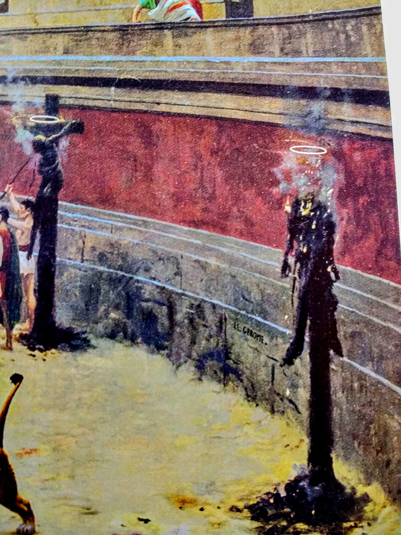
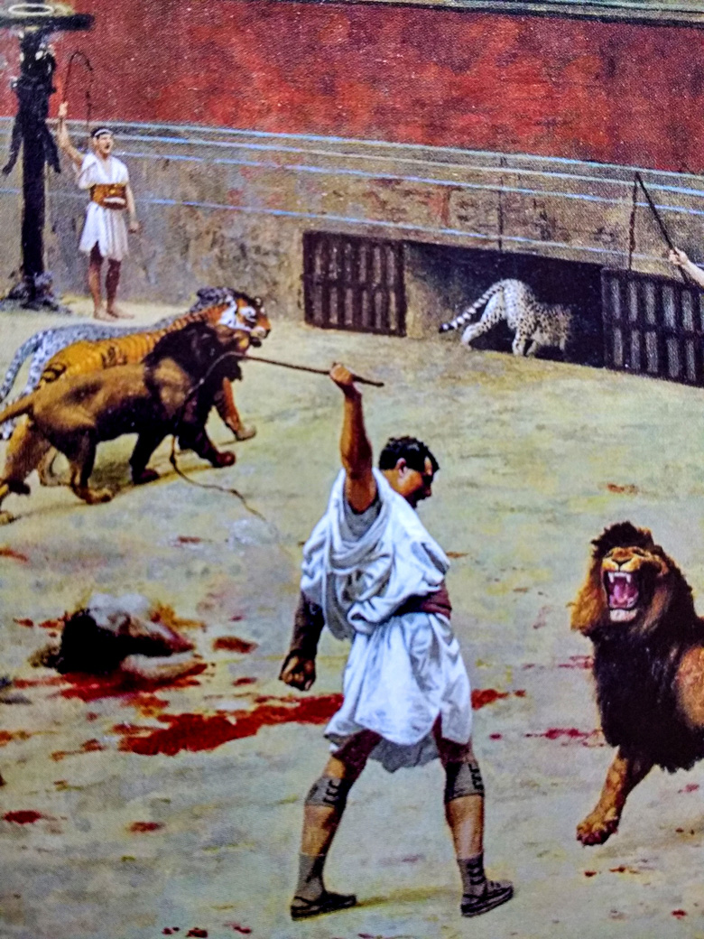
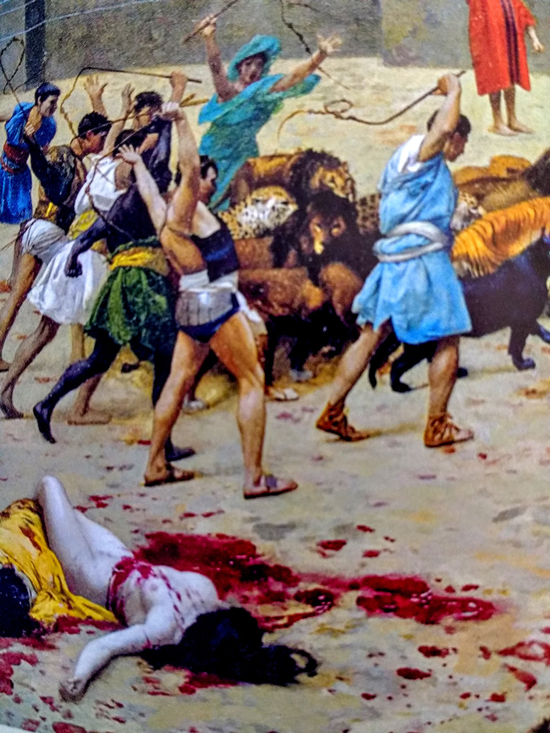
Check out this astonishingly violent, horrid painting! It is by 19thC French painter and sculptor Jean-Léon Gérôme who made many historical and Orientalist paintings. Many of his works are tinged with a strange sickly eroticism but this one is positively sick-making, in a fun Roger Corman / Tarantino kind of way. (the picture is in a private collection and is rarely seen, maybe never; would love to know who’d put this on his wall )
Jean-Léon Gérôme [CLICK IMAGE TO EXPAND] Gathering Up the Lions in the Circus Source: https://www.pubhist.com/w38153It depicts the end of a “typical” session of the Roman Games when the evil emperors would put a bunch of Christians in the ring with the lions, and watch the lions tear the Christians apart. The scene was probably influenced by the stirring descriptions of the carnage in the novel Quo Vadis by Henryk Sienkiewicz. In the 1951 film of Quo Vadis, meat was stuffed in “dummies” dressed like Christians and the lions – who had probably (and unethically) been starved before hand – tore them to pieces. Today, hopefully, we would not treat animals like that; thank god for CGI.
human ‘torches’ – people burned alive while hung from posts.
horrible chunks of flesh lying on the ground and a man whipping a lion. what’s not to dislike here?
now the gendered violence. an inexplicably naked, almost un-chewed woman lying provocatively in the gore. Fully disgusting.
These horrors were described in detail by the Roman historian Tactius. Remember, the term ‘historian’ did not mean then what it means today. Today you have to have a history degree to call yourself that. Ideally more than one degree. Tacit did not and basically his history of Rome under Nero – including the ultraviolence rendered here visually by Gérôme – was written at the behest of Nero’s enemies, meaning it is a hatchet job. Modern historians do not think that things were quite like Tacitus describes them, though his account of the factional fighting among the Roman elite was probably pretty accurate.
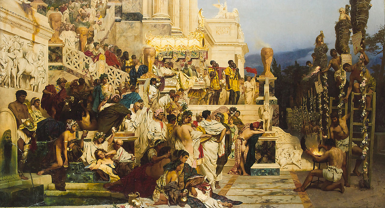
Interestingly, Quo Vadis author Sienkiewicz was himself probably inspired by the Polish academic history painter Henryk Siemiradzki; Siemiradzki’s Nero’s Torches, 1877 shows the decadent Emperor enjoying a lavish party while to the right of the painting a row of human torches is in the process of being lit. Imagine the smell!!!
Henryk Siemiradzki Nero’s Torches [CLICK IMAGE TO EXPAND] source: wikimedia.orgIt’s probably redundant to say this, but there is actually NO evidence that Christians were ever fed to lions as public entertainment. Persecuted, they were; executed, sometimes. But gobbled up in the arena, probably not.


![ean-Léon Gérôme [CLICK IMAGE TO EXPAND] Gathering Up the Lions in the Circus Source: https://www.pubhist.com/w38153](http://arthistoryfilm.org/wp-content/uploads/2018/05/gerome-lions-1.jpg)