
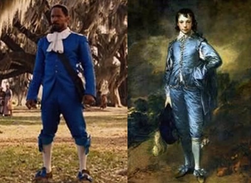
Django Unchained 2012
The western was the film genre that
brought the heroic figure together
with the overwhelming yet splendid
landscape. This case study looks at
a subversion of that cinema genre
through an unlikely relationship:
English portrait and landscape
painter Thomas Gainsborough
(Blue Boy, 1770) and American
filmmaker Quentin Tarantino (Django
Unchained, 2012).
Quentin Tarantino has often
been referred to as the archetypal
“postmodern” filmmaker. His films
bear the hallmarks associated
with postmodernist approaches:
appropriation of ideas, images,
and texts from different sources;
referencing other movies, books, and
art; pastiching established genres;
conflating popular culture and high
culture. In his later films, Tarantino
subverts existing genres, including
established trash and schlock genre
forms, and through the process of
subversion seeks to make a serious
point.
Thomas Gainsborough, the
eighteenth-century portrait and
landscape painter, could not be
further apart from Quentin Tarantino
at first glance. Yet Gainsborough
was subversive in many ways. Like
Tarantino, he broke new artistic
ground and challenged established
artistic forms. However, until Django
Unchained, it would have been
ridiculous to imagine a comparison
between Gainsborough and
Tarantino, or even to discuss them
within the same sentence. But in that
film, Tarantino and his design team
(J. Michael Riva and Sharen Davis)
appropriate a key element of one of
Gainsborough’s most popular and
most widely distributed painting,
The Blue Boy. It is from this starting
point that we will look at this case
study of Django Unchained and
Gainsborough’s Blue Boy.
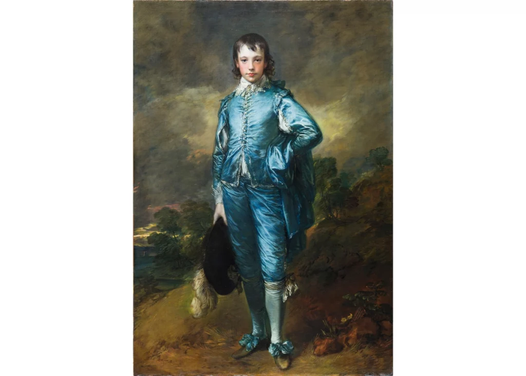
The Blue Boy was painted before
Gainsborough moved to London.
Born and raised in a lower-middleclass
family in rural Suffolk, he
moved to the spa town of Bath as
his portrait practice developed.
The problem for Gainsborough was
that he preferred landscapes. He
liked painting people—skin tones,
drapery, and costume—but, with the
exception of certain female clients,
he disliked painting portraits of the
type of people who commissioned
him. We know this because in his
letters he complains about his rich,
arrogant, empty-headed clients, and
says many times over that he wishes
he could just go to the countryside
and spend the rest of his life painting
landscapes and common folk. (His
own favorite was The Woodsman,
1788, a portrait of a poor forest
worker.)
It is not unusual for people
to dislike their day job and wish
to be doing something else. But
Gainsborough’s ability to create real
likenesses of his subjects made him
successful. He rejected the current
fashion of painting his subjects
dressed up as mythological beings;
he wanted to paint people in their
own clothes, looking as they would if
you met them. One of the trendiest
fashions in mid-eighteenth-century
England was to be painted wearing
the court costume of the previous
century, in the style of Dutch painter
Anthony Van Dyke at the court of
King Charles I. Van Dyke’s paintings
were widely copied; all decent
painters understood that they should
be able to make a Van Dyke to order.
Van Dyke painted his aristocratic
subjects wearing elaborate silk and
lace suits, one of the most influential
being Lord John Stuart and His
Brother, Lord Bernard Stuart (1638).
In the painting, Bernard Stuart is
wearing a fabulous pale blue satin
suit, though most of it is obscured by
a heavy silver cape.
Normally this is the kind of
portrait that Gainsborough would
have scoffed at replicating. But
two years previously he had been
elected a founder member of the
Royal Academy of Arts. It was never
an easy relationship; Gainsborough
felt like an outsider with something
to prove. He decided to challenge
the claim of the Academy’s head, Sir
Joshua Reynolds, that blue colors
should be used only as accents, not
in the main mass of the picture. He
painted a mass of blue, an exercise
in color and light reflecting on
silk, using layers of different blue
pigments: lapis and indigo, cobalt
and turquoise, together with charcoal
and creamy white, and sent The
Blue Boy to the Royal Academy’s
1770 Salon.
But who was the blue
boy? He was not an aristocrat or
theater celebrity who would normally
command an Academy-level portrait.
He was Jonathan Buttall, a good
friend of Gainsborough and an iron
merchant in London. It was not a
commissioned portrait: Buttall posed
for Gainsborough as a friend. Buttall
was far outside the circles of power;
he could never have worn court
dress. Therefore, The Blue Boy is a
subversion. It is not only a painting
of an eighteenth-century man in
seventeenth-century dress; it is an
aristocratic portrait that portrays a
middle-class man.
The painting became the talk of
the Academy, and its success spurred
the painter to move to London two
years later. He was commissioned
by the royal family, and his success
enabled him to take more time out
to paint his beloved landscapes.
But it was not that simple. Soon after
arriving in London, Gainsborough
fell out with the Royal Academy and
spent the rest of his life in rivalry with
Joshua Reynolds. He would probably be
surprised to know that The Blue
Boy remains his most popular and
most influential painting—though
not his best—while to him, it was
a caprice. While Jonathan is not
portrayed heroically, he stands
for the bourgeoisie, excluded at
that time from political power and
influence, which was still in the hands
of the aristocracy. Dressing him in
Van Dyke costume must have been a
bit of a joke, a subversion to slip into
the heart of the Establishment, the
Royal Academy.
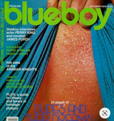
By the late nineteenth century,
The Blue Boy was an internationally
popular print and is said to have
inspired the 1919 film Knabe in Blau
by F. W. Murnau (now thought to
have been lost). Quentin Tarantino
and costume designer Sharen Davis
likely first came in contact with
the picture as a kitsch print; it was
ubiquitous throughout the 1970s,
appearing in many inexpensively
printed versions. Blueboy was also
the name of a US gay porn magazine
of the 1970s.
Tarantino, like Gainsborough,
started as a rank outsider. He has
talked many times about his lack
of any insider connections to the
movie business, his total lack of
power or influence when he started
his career. It was hard. “Pauline Kael
used to say that Hollywood is the
only town where people ‘can die
of encouragement’ and that kind
of was my situation,”5 he says.
Like Gainsborough, Tarantino has to date
shown no intention of following an
established career path. Despite his
love of popular culture, he has not
made a studio franchise picture.
He regularly takes a drubbing from
critics, who decry his unabashed
love of trash cinema, and those who
criticize his films for violence.
Django Unchained is in part a
road movie; as production designer
Michael Riva says, it is Django’s
psychological journey, but it is also
a geographical journey through
landscape. Django and Schulz
arrive in Tennessee and head to
a haberdashery, where Django is
invited to pick out a costume in order
to play the part of Schulz’s valet.
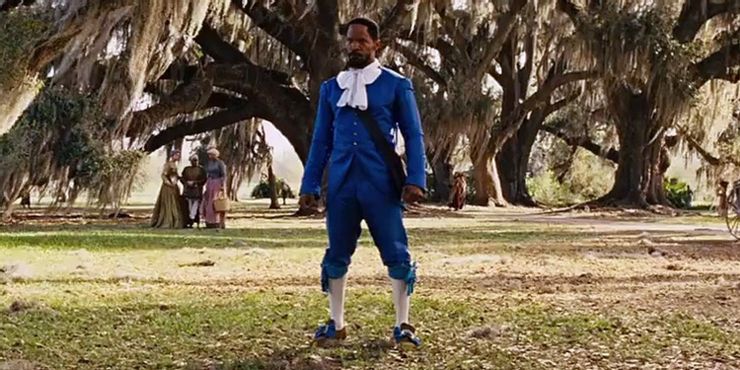
The next shot is of Django wearing
a bright blue suit, styled in a vague
pastiche of seventeenth-century
fashion, the archetypal Blue Boy.
The connotations are rife: The Blue
Boy is a well-known kitsch print, but
the painting resides in the important
Huntingdon Museum in Los Angeles.
“Boy” was a condescending term
used to address all African American
males regardless of age, particularly
in the South.
We first see Django in his blue
suit from the side, riding a horse
through a landscape, a cotton field.
The composition of this shot is
itself a nod to the subgenre of the
equestrian portrait.
Van Dyke made a
famous equestrian portrait of King Charles
I, which was repeatedly copied, and
Gainsborough made variations on
Van Dyke (as exercises, or simply to
pay the bills). And the David portrait
of Napoleon is an equestrian portrait.
Equestrian connotes aristocrat and
hero. But in that costume? Not yet.
The blue suit makes Django stand
out, command attention, and is
ineffably striking. Riva notes that
“color is a really important to me,
it’s a mood establisher.”7 The intense
blue (much brighter than The Blue
Boy’s silk) acts paradoxically as a
red flag to the white supremacists
he encounters. But both Jonathan
Buttall and Django are in costume;
Jonathan could never dress like that
to do his daily business as an iron
dealer. Django soon equips himself
in what Riva calls “warm nicotine
colors,” in more practical—and
stereotypically “western”—garb.
The Blue Boy motif is incongruous
in a western. Yet, as Tarantino
points out, “One of the things
that’s interesting about Westerns in
particular is there’s no other genre
that reflects the decade that they
were made and the morals and the
feelings of Americans during that
decade than Westerns. Westerns
are always a magnifying glass as far
as that’s concerned.” He notes that
“Westerns of the ’50s definitely have
an Eisenhower birth of suburbia and
plentiful times aspect to them. . . . the
late ’60s has a very Vietnam vibe to
the Westerns leading into the ’70s,
and by the mid-70s, you know, most
of the Westerns literally could be
called Watergate Westerns because
it was about a disillusionment and
tearing down the myths that we
have spent so much time building
up.”
Django is a western that
subverts the dominant white male
hero in a wish fulfillment revenge
fantasy that forces the audience
to confront race and slavery. It is
probably too much to consider The
Blue Boy as a wish fulfillment class
fantasy. Perhaps we should consider
Django Unchained’s Blue Boy motif
to be a parody, with its political
connotations, while Gainsborough’s
Blue Boy is an apolitical pastiche.
Yet Gainsborough’s own letters bear
witness to his private discomfort with
the upper class.
Tarantino and Gainsborough share
the status of being both insider and
outsider. Neither man belonged to an
influential coterie or was a member
of an art or film dynasty. Both gained
success on their own terms, even if
Gainsborough sometimes whined
about his clients.
You don’t actually need to
know anything about the Van
Dyck paintings or Gainsborough
to appreciate Django Unchained.
But understanding the art historical
provenance of the costume, with its
many underlying connotations, can
help you see why it is so effective,
and how art can be so influential
that it manages to be replicated in
unexpected places, while continuing
its original message.
![Giorgione - Three_Philosophers [Google_Art_Project]](http://arthistoryfilm.org/wp-content/uploads/2018/04/Giorgione_-_Three_Philosophers_-_Google_Art_Project-300x255.jpg)