MARK ROTHKO AND CINEMA

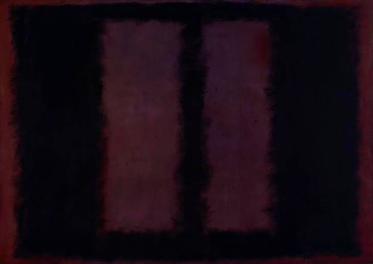
Mark Rothko’s Black on Maroon 1958, at the Tate Modern, might not seem to have anything at all to do with cinema. but I would argue that it (and all Rothko’s work) teaches us a lot about colour. How is darkness made visible? How to differentiate two colour darks and make them both harmonise and clash? How can we use this knowledge in film making? And how to immerse your viewer in the moment of the film by the use of colour? Rothko wanted the viewer to be ‘in’ the painting, not standing looking at the painting, so he made the huge fields of color enormous, overwhelming. And you can feel this strongly in the Tate’s Rothko room.

ROTHKO TATE MODERN

Welcome!

Giorgione - Three_Philosophers [Google_Art_Project]
Giorgione – Three_Philosophers [Google_Art_Project]
Since cinema’s earliest days, literary adaptation has provided the movies with stories; and so we use literary terms like metaphor, metonymy and synedoche to describe visual things. But there is another way of looking at film, and that is through its relationship with the visual arts – mainly painting, the oldest of the art forms. Art History for Filmmakers is an inspiring guide to how images from art can be used by filmmakers to establish period detail, and to teach composition, color theory and lighting.

The book Art History for Filmmakers – published by Bloomsbury Press and available for all good book dealers – looks at the key moments in the development of the Western painting, and how these became part of the Western visual culture from which cinema emerges.

As the author of this book I’m looking forward to readers’ comments and questions. I will also post my own short film and exhibition reviews and information.